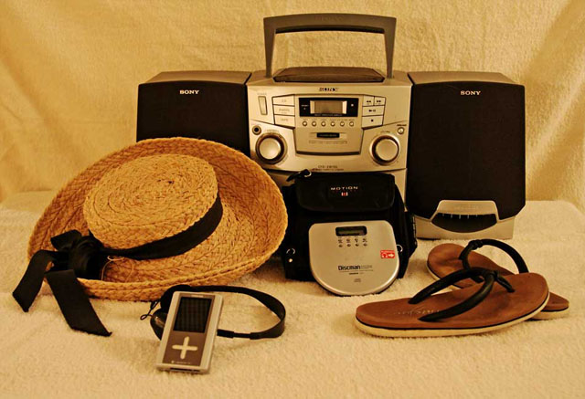
You need to work on your backdrops. If you're going to use a white, cloth backdrop, make sure it drapes in a nice long curve under the subject, instead of having perpendicular surfaces - the edge where the wall meets the floor/table is messy.
Also, your lighting needs work: to get that bright white, studio type background that you see in stock photography you need to light the background quite brightly, and get your subject further away from the background. You can even overexpose the subject a bit to really wash out that background.
Finally, the white balance wasn't quite correct in this shot either. Find out how to set it in-camera, or read some of the tutorials on this site to learn how to adjust it in your photo software.
Although my comment may seem long and critical, don't despair. I think it's a great idea, and a decent shot. But it can be improved, and I'm sure you want to learn how.
What I liked: Idea is cool, and we have progressed alot in that area.
What might improve the image: Changing the color balance, the image seems too yellow.
NOTE: I'm trying this system of giving comments on all images I vote on, my score of the photo, and what I did and did not like. Please, I'd like feedback on whether or not this is helpful, so feel free to give me a PM with any feedback - positive and negative are welcome. Also, my profile has more about what all of the terms in my grading system mean to me.
Good choice of items to show progression! The lighting/white balance combination is a little off to me, causing the yellowish cast over everything. A tweak in levels to bring out the highlights might help a bit.







 Add photograph to your favorites
 Add photographer to your favorites


 Photographer found comment helpful.


