|
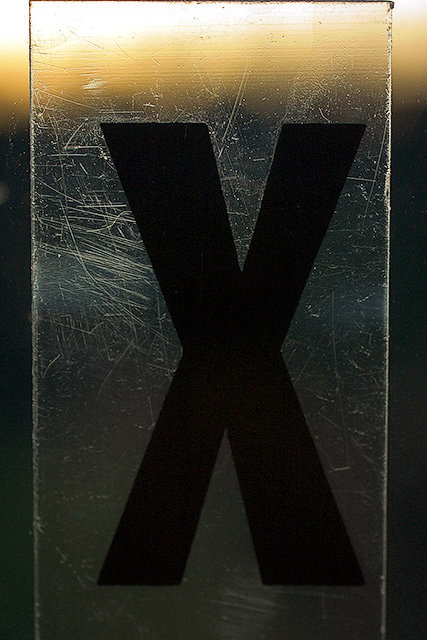
didn't vote in this one but this would have garnered a 7 from me. I like the boldness of the x, it is off-set by your trademark soft hues. The glass/plastic edge is a great element. I do agree with the comment on the loss of detail towards the bottom. It doesn't balance out the inteest created by the other three edges. My favorite aspect is that each element is slightly off-center -- inspired. |






 Add photograph to your favorites
 Add photographer to your favorites


