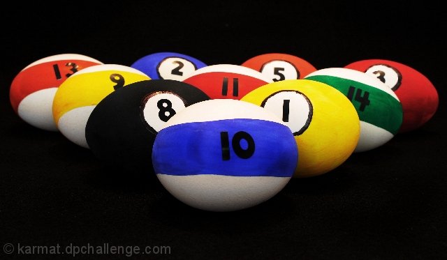
The most annoying part of this was painting the eggs. The paint simply did not want to stay on the shell. What you see is several (like 6 or 7 for some colors) layers of paint.
Statistics
Place: 162 out of 219 Avg (all users): 5.0149 Avg (commenters): 7.4000 Avg (participants): 4.9022 Avg (non-participants): 5.1101 Views since voting: 857 Views during voting: 304 Votes: 201 Comments: 7 Favorites: 0
I can't believe that I drew a Karmat to critique! Whew the pressure! :-P
Boy, I don't know where to start with this one... First of all, I really think the idea is unique and I truly appreciate the work that you put into this concept. However...
With a studio set up shot like this, detail is everything. Hit them dead on and the shot works. Miss a couple and the shot suffers. Here, your striped 'balls' have lines that aren't straight. I know how hard it must be to try and paint straight lines on an egg, but to make this really work, they would have to be perfect. You also have several spots on several of the 'balls' where it looks like there is too much paint making it look splotchy.
There is another effect going on here that probably affected your score and that was mentioned by a couple of the commentors. This really looks distorted. I know that it's not, but that's what it LOOKS like. This makes the overall image look very distorted and hurts my eyes to look at it too long. Your lighting is a little flat and that makes the shot look flat overall. This seems to exagerate the distortion effect...
Overall, a nice idea, but one that I would be amazed to see pulled off to such a degree that it scores well here.
regrettably, it looks like a badly squished photo rather than what i guess are a bunch of a bit too realistically painted eggs. i am slightly worried that a lot of voters are not going to see the added depth of the subject matter here, because you did such a good job decorating them... i like it though - 7.
ok, at first I thought stuffed, like, beanbags or something, but now I realize they're eggs... cool idea, must've taken you some time to paint them... I think your photo is technically really good and aesthetically pleasing, the only thing I might suggest is more negative space around the edges, and maybe a more squarish crop, 7 from me






 Add photograph to your favorites
 Add photographer to your favorites

 Photographer found comment helpful.


