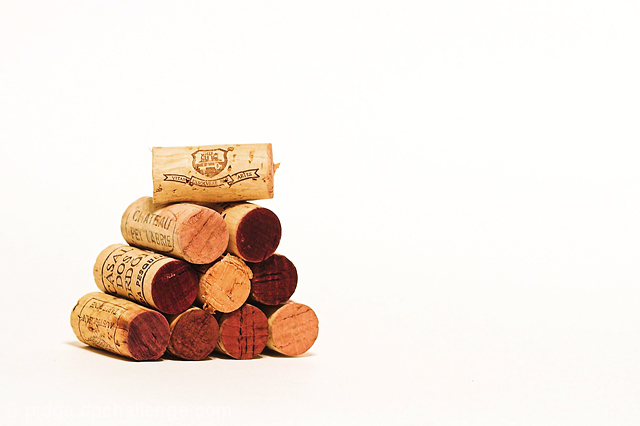
Good title, fits the challenge. I think the composition is good, the pyramid is a nice change from things just all lined up. I don't think I like how isolated it is, at least not on pure white. While it certainly highlights the corks and makes them stand out, I find myself at a loss on what to look at next. The corks have some good interest in them but much of it is obscured by the pyramid usage, maybe if the pyramid was skewed slightly to one side so more of the cork writing was visible that'd help. I don't know.. I wish the image was warmer I guess, inviting. Technically its nicely done but it doesn't hold my attention upon viewing. I gave a 5






 Add photograph to your favorites
 Add photographer to your favorites


 Photographer found comment helpful.


