|
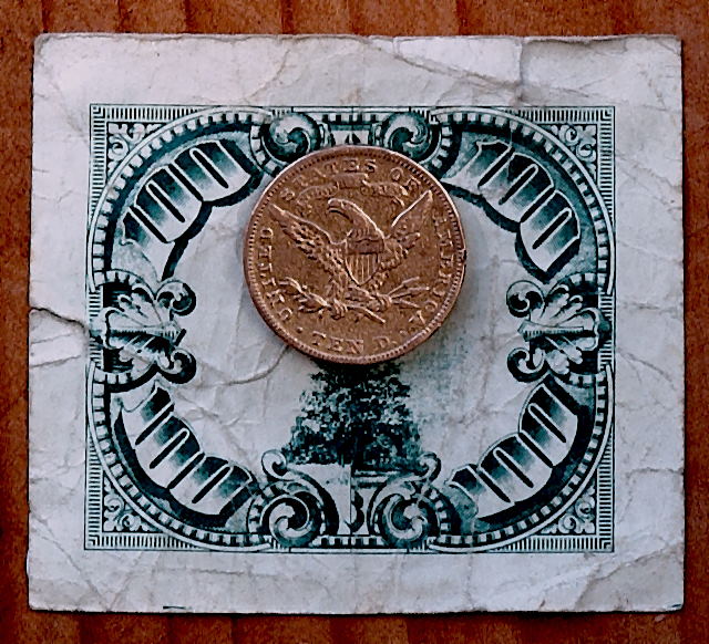
I really like how the different colors play off each other and the mixture of textures, wrinkled paper and worn dime(?). The color on the dime looks a bit odd to me though, not the typical silver but more copper.. so maybe its a 10 dollar coin. I wish the coin had just a bit more detail pulled from it, as it is a main subject to the image. The lighting looks good though slightly muted. I think the composition could be better to add some drama - perhaps some interesting way of folding the paper beneath the coin or creative use of light to play up the word "ten" on the coin. As it is, its pretty static and flat and needs more dimension. 4 |




 Add photograph to your favorites
 Add photographer to your favorites

 Photographer found comment helpful.


