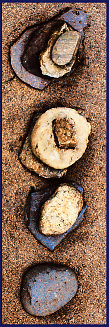
rocks in the sand. curves. copied layer, applied fresco filter with low opacity on "multiply" mode.
post-challenge: I like this picture, don't mind the grainy look, but I will admit that I took this under low light conditions due more to poor planning (and having a life besides photography) than anything else. I would have prefered a sharp picture to play with. I think I still would have gone with a "grungy" look to evoke a sense of primitive numerology, but it would have been sharper.
Statistics
Place: 186 out of 219 Avg (all users): 4.7865 Avg (commenters): 5.8333 Avg (participants): 4.5909 Avg (non-participants): 4.9519 Views since voting: 868 Views during voting: 290 Votes: 192 Comments: 8 Favorites: 1 (view)
I love the simplicity of this one very much, and actually like how you have put this one together.
The tight crop really suits this image, and I actually like this one so much that I am adding it to my fav's..........
Don, I gave this a 7, because I didn't get the connection to the challenge: otherwise it would have ben an 8. Now I see that I should have just counted the stones, so I guess I was a bit dense when first viewing this. :(
The unusual crop of this picture made it really stand out of the rest in the challenge - it's very fresh. I liked the colours, but I think that you may have overexposed a little bit: the second stone from the top looks like it's missing most of the detail.
I like the different portrayal of the number 10. The composition is good. Lighting looks good though maybe a smidge too harsh. Focus is okay, though I'm not sure if its so raw and harsh looking just because of the light or if some oversharpening or overcontrasting has been used. The different textures are nice and I like the earthy colors and how they interact with one another. I really enjoy the choice of counting to four to depict ten. I gave a 5






 Add photograph to your favorites
 Add photographer to your favorites

 Photographer found comment helpful.


