Darn WPL... Have been sick for 5 days and would NEVER had shot this if it were not for it, I felt I couldn´t let my teammates down. That doesn´t mean I dislike the shot, I think it came out pretty well considering... Wish I could have spent more time on it, would have love to shoot this in a gym/real basketball arena, having that out of focus in the backround but I really wasn´t up for that, this photoshoot was thrown together last minute.
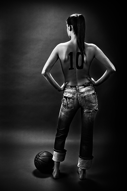
As usual, Henny took care of the makeup bit, only makeup is really painting the "10" on her back. Lit with 3 lights, one in front of the model giving the hairlight and highlights on shoulders and arms+giving the shadow from the ball, one big softbox to the left for main lighting and a smaller one to the right to fill-in.
LOTS of PP on this one, mainly adding the darkening of the backround on the left of her either by dodge/burn or curves on just that part of the photo. Removed a shoulder tattoo on her right shoulder as it looked out of sync with the rest of the image. Used channel mixer and mainly the blue channel to make it b/w. Curves again on the whole image to increase contrast and finally sharpened after resizing.
This is early in the photoshoot wich only took about 30 minutes (I really felt bad with the flu and wasn´t "in the groove"), we actually painted a "#" symbol on her left shoulder and it looked much cooler but her stance in this photo was good so I used it instead.
The thought behind the image was that it would be an imaginary ad for spalding, the maker of the basketball and actually I blew it since the ball rolled a bit for this particular frame, it was showing the spalding and NBA logo on it in most frames but not this one, the best frame so I imagine I would have been fired if I had been shooting it for real :)
Statistics
Place: 10 out of 219 Avg (all users): 6.5211 Avg (commenters): 8.0000 Avg (participants): 6.3125 Avg (non-participants): 6.6923 Views since voting: 5304 Views during voting: 652 Votes: 213 Comments: 36 Favorites: 6 (view)
Being number 10 in a challenge called "The number 10" with an entry called "#10" is something you should be very proud of, Lárus. Much better than being f.ex. number 9. Even though it is apparent that you had some kind of flue during the shooting the photo is excellent. I would have given it 10 if I had voted. Congrats!
i really liked this all the way thru voting and results....
however, I wished it was a football instead of a basketball. The placement of the secondary subject doesn't make sense. she should have been palming the bball, because any player would know that a basketball is in an unnatural positon next to the foot. Details.....
what I like:
this is a sexy pic of a lowly model of course. Very creative to put the 10 on her back. I like the lighting overall it gives a good feel.
What I don't like:
it looks little heavy in the burning in spots especially around her legs. The main focus seems to be on her butt whereas it would make more sense to be on her back.
Beautiful b&w portrait. The tones are amazing and the composition is solid... so well done. I like the idea and I believe this one will take a ribbon - 10 :)
Very nice. I really like it. The lighting is perfect. I like the vignetting around the border which makes her appear to be highlighted. 8 ( +1 because she's just so damn sexy) :) 9
I like the idea of this. Not sure about the basketball, but the lighting is good. Something about the background bothers me. It has a kind of blotched look to it. But considering most of the other entries, this is by far much better than most. 7






 Add photograph to your favorites
 Add photographer to your favorites

 Photographer found comment helpful.


