what I like:
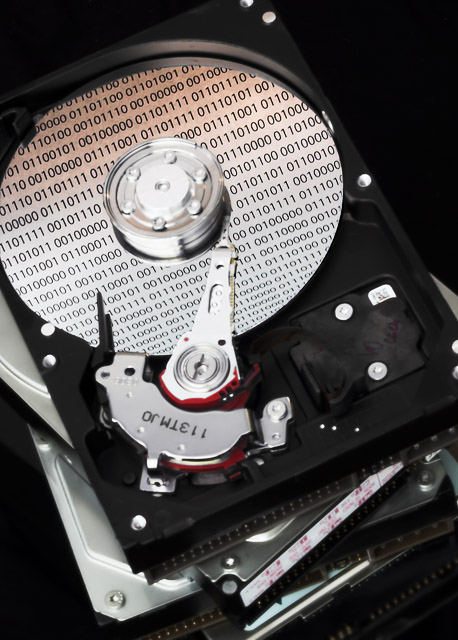
good idea, well executed. I hadn't really thought of binary for this challenge but it fits perfectly. clever.
What I don't like:
it would be nice to have a bit more depth of field so the top drive was more in focus. Are the numbers a reflection? In anycase the way they get smaller and seem to "curve" towards the bottom of the disk gives it a rather odd perspective making it seem as though the disk isn't flat. I also think the crop was a little tight.
Interesting subject and composition. I originally wanted to say the focus seemed a little soft, but now I'm wondering if the DOF is a little too shallow. Very nice!
I think a great DOF would have helped the sharpness of the hard drive. Also, it looks like your reflecting paper was bent, creating a curvature to the numbers. I would have gone for a more straight approach.







 Add photograph to your favorites
 Add photographer to your favorites


 Photographer found comment helpful.


