|
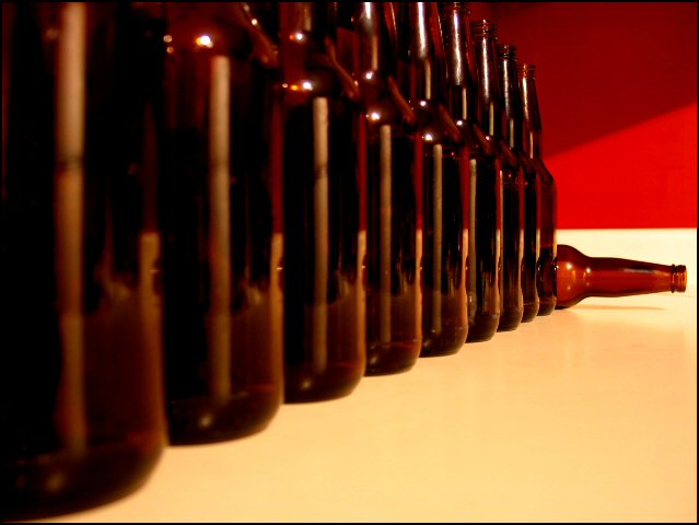
Good lines and perspective useage. I like the way the colors work together but I'm not sure I like the shadowed tone of the table/counter so maybe an additional fill light would be better or going through the beer bottles to give an amber glow. Focus is a little soft too. I'm not sure if the appropriate white balance has been used (the color of the white/offwhite seems a tad strange). Composition is interesting but there isn't anything that really draws me in, no pop or wow factor for me. 4. |





 Add photograph to your favorites
 Add photographer to your favorites


 Photographer found comment helpful.

