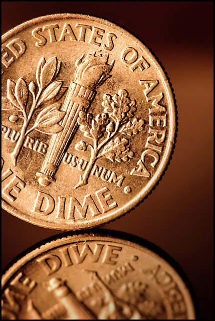
This challenge left me almost blank with ideas, one idea was not going to happen under the circumstances and then there was this one, and I dont plan on boring you with ladybugs again ;). This is not the image I would normally go for on the creativity scale but it was a good study about lighting and shadows and was well worth a try. This might as well have been a Basic Editing challenge. Didn't even have to clone out a speck of anything. Tone set via White Balance, shot in jpg.
Thanks in andvance for your comments :)
Statistics
Place: 57 out of 219 Avg (all users): 5.7526 Avg (commenters): 7.4000 Avg (participants): 5.5618 Avg (non-participants): 5.9143 Views since voting: 959 Views during voting: 291 Votes: 194 Comments: 12 Favorites: 0
This shot begs for my what I like/don't like treatment, so here goes!
What I like: You have spot on focus here! Great detail. Your lighting though a little dull is enough to bring out the depth of the coin, especially in the reflection. You can even see the textures in the 'smooth' part of the coin. Great DOF to make the reflection go out of focus in the foreground to give some sense of depth to an otherwise flat shot. Great work in that effect!
What I don't like: The color cast does put me a little off. It looks, color wise, more like a penny than a dime. I am more of an old school, traditionalist type of photographer and would prefer to see the silver color. I do like the tone of the background though. I'm assuming, though that this is where the shading of the coin comes from. I don't like the brighter part of the background. I think that this steals a little of 'focus' away from the dime itself. I do believe that you could have brought out even more of the depth of the coin by playing around with the lighting more. This is very difficult to do with a coin as thin as a dime is. I've had better luck with thicker coins in this aspect.
All in all this is as you put it a great study shot and the type of shot that I think all photographers should play with. I know I've done my share of coin shots though most of them will never see the light of day.
Very nice macro. Everything of importance is crisp and clean. Lighting is good. I even like the different tone to this, I think leaving it as the shiny silvery color normally seen in dimes would make it too glaring and distract from all the detail. I like the addition of the reflection as well and it has some great clarity to it too. Composition is great, its not just smack dab in the middle so it has a good interest level. Simple, clean and crisp. I gave a 7.







 Add photograph to your favorites
 Add photographer to your favorites

 Photographer found comment helpful.


