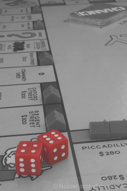
I like the way the desaturation came out in this one. My only issue with this image is that I'm worried the top-left of the image is a bit busy and is taking the eye away from the dice. The only other crop that I liked was a landscape one with just the bottom of the image from the 'Regent Street' property down - that does focus a lot more on the dice but I felt that was 'just another photo of dice'.
Editing Steps: rotate
brightness
desaturate yellow, blue, green
selective desaturate red
resize
Post Challenge: Yes, I mucked up - I should have noticed the contrast was bad. The lesson learnt here is to take your time and review before you submit!
Statistics
Place: 188 out of 219 Avg (all users): 4.7708 Avg (commenters): 4.5714 Avg (participants): 4.4405 Avg (non-participants): 5.0278 Views since voting: 1041 Views during voting: 286 Votes: 192 Comments: 20 Favorites: 0
I suggest you save at a higher quality setting always (your JPEG is only ~30KB, but you can use up to 150KB, so make use of it).
The editing steps: (in the free GIMP tool)
- Open original.
- Duplicate background layer. Unsharp mask with radius around 50, amount=1.4, threshold=0. This adds Local Contrasts Enhancement and can really reduce the muddy look on a lot of images.
- Duplicate background layer. Add selective gaussian blur to reduce the JPEG artifact appearance.)
- Duplicate background layer. Add gaussian blur at radius 5, change blending mode to soft light.
- Create new layer, radial gradient fill followed by brushing with a soft round brush to create a grayscale vignette mask. Set blending mode to soft light.
The layers' opacities were adjusted throughout the process until I was happy with them.
(Normally I would try the Curves tool first, but I wanted to do something different and ended up happy with the look never using the curves tool.)
Hope this gives you some ideas. Have fun!! It's a cool image BTW.
you needed to experiment with levels and then with curves and brightness/contrast to get a little more contrast instead of the washed out looking grey...might have had more punch if you were to keep the color background: maybe just the green houses because of the complementary color of red...check on all my messed up images..haha.
The title doesn't fit the image. To be 10 spaces from Go you would be on Go To Jail (I think that is the square under the dice). This image could also use one of the game pieces in it to help it look like an active game. My suggestion would be to shoot from the Go corner with an equal number of squares on each side of Go and use a square crop. Put the game piece a couple of squares before Go and title it Collect $200 (USA game value, sorry). The square crop would give it a game board feel with some negative space in the upper right corner. I think the color of the dice could be a little richer also but I'm not sure which color/hue would need to be tweaked.
I agree with the previous comment about the crop - either that, or just under the Y with a bit looser to the right. I like the positions of the dice on the board and relative to each other and the hotels/houses/motels/cities/plastic things. I also like how the plastic housey things are placed on the board - they are in the correct places but not 100% perfectly set. It makes me feel like somebody is actually playing a game, and not that this was a set-up shot, and I like that feeling of reality.
I like the use of black and white while keeping the dice red. I think it might look better if you cropped it just below the Chance cards toward the top, avoiding distractions to the foreground/subject. This shot has a lot of potential to be cool.
Would love to see more contrast - whiter whites - blacker blacks - I think this would push your reds too - I would love to see those more saturated.
Maybe from a compositional standpoint, shoot so the lines of the board are at harsher angles to the edges of your frame and I think you'll find a stonger composition.






 Add photograph to your favorites
 Add photographer to your favorites


 Photographer found comment helpful.


