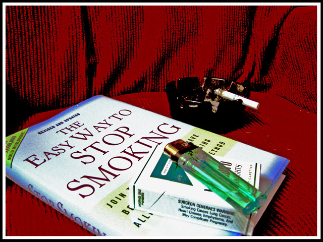
Sorry but I gotta say I don´t care for the post processing at all, the look of the image doesn´t appeal to me. Specifically the blown highlights on the book and cigarette package, the texture on the red cloth or material and the wierd grey pixelation on the lighter. No offense meant, just make a habit of explaining why when I vote 3 or lower and this image got a 3 from me.
Probably not a photo the authors would use to advertise their book, but it does get the point of your title across. The overprocessing on the chair is kinda cool.
I expected to see more entries with this theme but there aren't so grats on originality. The post processing really blows it for me, but otherwise a nice shot.
The saturation effect here is actually to my liking, just try to keep from blowing the shadows out (they turn grey, like in the lighter) next time. Meets challenge well in a semi-humorous way, something I really liked about it.






 Add photograph to your favorites
 Add photographer to your favorites


 Photographer found comment helpful.


