First Impression:
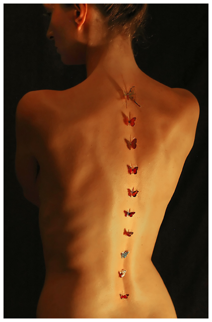
Creative idea and a clean and simple setup. I find the crop a bit distracting with the cut off face taking away focus from the butterflies, and the lighting is a bit too focused on one area for me.
Composition/Background:
Good choice of background color. I like the slightly curved line of the butterflies being off center. I hadn't noticed that the shape of her back was supposed to mimic the butterfly shape as you mentioned in your photographer's comments, but that does hold true to some extent. I like how the butterflies get smaller as they go down, but that one little blue one seems a bit out of place.
Technicals:
I think the lighting here has both its pros and cons. It does have a nice warm glow to it, which is exactly what you wanted for this shot, but it does seem a bit harsh and focused on one spot. I wish a wider part of her back was lit instead of it being focused mainly on the lower back. Having it focused in that one area brought out shadows along the ribs and other muscles/bones that distract from the line of butterflies.
Post Processing:
I find the crop to be distracting here. I'm not a fan of having her head and ear both cut in half. I would probably prefer to have just a bit of the chin left in place so that it's not just a back, but it's also a very anonymous shot at that point, leaving the entire focus to be on her back and not who she is. It's difficult to comment too much on the processing, since you didn't include any information about what you did in your photographers comments.
Last Thoughts:
After reading the other comments that were made during the challenge, it seems like you had a few others who mentioned some of the same issues that I have. Overall though, it was a clever and simple setup which was enough to get people to give it that little bump to a 6 the majority of the time instead of their average 5 with their first impression, with no really low votes. Congrats on the 16th place.
I hope this was helpful. Please feel free to PM me if you have any questions, and good luck in your future challenges!
what I like:
Creative concept. from the thumbnail I was thinking tattoos - but I actually like the 3D butterflies better ;) They were well placed I think this is a good model for the shot.
What I don't like:
the lighting seems a bit hard. For something like this with delicate butterflies it would have been better to use more delicate lighting. It has a nice warm glow but is a little too bright on the right and dark on the left. I also would like it better if it was cropped a little lower. We can't really see her face anyway so if you cropped it right about where the shadow line is at her jaw I think it would have made a better study of form.
I love the light, the pose and the use of the butterflies. In some parts it looks as if it may be a tattooed line. I think playing that up and then as it went up having the butterflies look as if they were flying off her back would've been interesting. That said I like the lines of the spine and the lovely butterfly colors contrasting to the glowing skin. I wish the side of the face were more shadowed so the attention would be competely on the back and butterflies (as is the light catching the face draws my attention away). Finally, I'm not really liking the way the ribs show, it has a horizontal line to it that takes away from the curved vertical line of the back in a displeasing manner. Overall I gave a 7





 Add photograph to your favorites
 Add photographer to your favorites

 Photographer found comment helpful.


