Hi Margie -
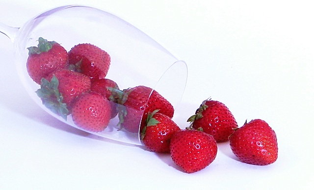
For me, this suffers on two levels. First and foremost is that the light is just too harsh. The whites are super bright and fog up the glass. The color on the strawberries seems washed out in comparison. Overall, the image comes across looking fairly flat.
The lightbox did a good job of eliminating the shadows, but perhaps the desk lamps could do with some diffusing, say with white muslin or wax paper.
Don't be afraid to bump up the color saturation.
One of my tricks for toning down bright spots is a reverse S-curve. In a normal S curve, you select the three points (lower, mid and upper), pull the lower point down a touch (deepens colors and shadows) and the upper point is pulled up (brightens highlights, lightens shadows). To tone down super brights, do exactly the opposite - lower point goes up, upper point goes down. Then I usually do a second curves layer, also 3-points, in which I pull the lower and center down just a touch, and leave the upper where it is. I'm betting this technique would work some magic here. :) |





 Add photograph to your favorites
 Add photographer to your favorites

 Photographer found comment helpful.


