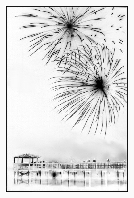
rotated 90 degrees clockwise, leveled the dock, cropped, brightness/contrast, grunge-smudge-soften brushes, greyscale, and then I threw ALL of that out the window and played with some adjustment layers. I loved the "disolve" on this particular shot at 100%. I think it makes it look like a drawing.
So in daring to be different and have people stop and say "WTF" after all of those color firework shots, I hope it pays off. It's a love it or hate it scenario but I thought it would be fun to see the reactions.
Disqualification Details
Multiple accounts are forbidden.
Statistics
Views since voting: 2531 Views during voting: 740 Comments: 67 Favorites: 25 (view)
Distinctive shot! Wait, you rotated this 90 degrees? You were going to enter it with the dock pointing up on the left? I think this way is better.
lol. Now that you mention it I don't know where I got the 90 degrees from. I think when you go to turn it clockwise or counter clockwise it says "90 degrees" in the program. But I had to turn it upward from on its side and chose the clockwise I believe.
I'm so amazed! The voters *almost* got this right! This is easily the best in the challenge - amazing PP seeing the original - great work to get from there to here.
After coming back to have a look at this shot again, and seeing the original, I like it even more.
This one should get a special award for creativity in the post-processing phase. You took a mediocre shot and turned it into something that really stands out.
Congratulations. Great entry.
Here is the original. As you can see its a bit dark and barely needed a crop. I think I only had to crop it because of rotating it slightly to get the dock level. That is really a wharf and I should have called it that. lol.
There were only about 18 people on the wharf. This a large lake and a small town display. The normal town goers don't really go much anymore so the crowds are minimal. I think the fact that there were so few people and so little confusion below in the shot and on the wharf made this appealing. I knew I had to get a foreground "something or other" so I walked around the lake till I had the dock in front of me.
I did toy with the original and in color but the light inside the gazebo at the end of the wharf had that yucky incandescent lighting glow. It was "ok" but not great although it balanced the shot. Also the fireworks were way up, way low and then medium. I got a few captures of it medium height and this is one of them.
This was my first try at fireworks and I am very pleased with the results. I have backyard ones and this display from the holiday week. Now that the challenge is over I can work on those and put them in my port to. I will work on some tomorrow. :)
Thank you jbsmithana. Shhhh, but I agree with you lol. I did get more 10's then the top winners though! :) It's just one of those things. I did get some 1's, 2's, and 3's from the haters of this love or hate it shot and that was the downfall for ribbon-hood.
Back to bump. This is my top pick for ribbon. Nice balance in the composition and the negative type coloring makes it so interesting....almost feels like a charcoal drawing. 9
negative images often get a bad rep, but I think this actuallu works very well with the image, giving it something different that you wouldn't normally expect. Hope this does well, and good luck!
What makes this so striking is that the dock looks fairly normal in spite of the negative image. This strengthens the feeling of anomaly created by the reversed bursts of fireworks. 10
This is quite different from the other entries, and as such stands out a lot. I wouldn't have thought of reversing the shot, but I really like the effect. Good thinking, well done, good luck! 10
I've seen fireworks from every other POV in this challenge - thank you for taking time to show them to me in a new light.
I hope this goes over well, that you get the ribbon you deserve for compositional and creative excellence - but I have no faith in the voters to see that.
Hmmmmm....already double the views of all other images....played with the processing...from Florida....not hard to figure out this was yours maestro. It is a fantastic composition and the idea for the processing was very creative...Nice to see it's so well received.





 Add photograph to your favorites
 Add photographer to your favorites


 Photographer found comment helpful.


