Author Thread
Post actions
Very nice concept. Congratulations on your top 20 finish.
Post actions
* Greetings from critique club *
Post actions
Tx all for your nice comments!
Comments Made During the Challenge
Post actions
Post actions
Wonderful composition and color. The design and display are very pleasing... but not stationery.
Post actions
Post actions
This must also be a ribbon contender. Excellent.
Post actions
Post actions
clever! i especially like the lighting
Post actions
Post actions
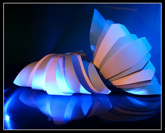
Great lighting and pattern. The cropping on the right and the glare on the left are the only things keeping this from being in contention.
Post actions
I like the blues in this. Stronger contrast would improve this a bit.
Post actions
Great lighting on this, not so sure about the highlights... it reminds me of a late night at the office
Post actions
Oh this looks like the opera house!
Post actions
Excellent, creative, great lighting.
Post actions
Interesting idea. Nice muted colors and reflection. I dont much care for the glare on the left corner and the cropping out of the edge of the right croissant. But a good job overall.
Post actions
My favorite so far! Beautiful lighting! Very creative composition. I'm sure this will do very well. Great job!!!
Post actions
Post actions
Fantastic lighting, and nice composition
Post actions
great title...nice lighting and shot
Post actions
Post actions
Croissants, yes. But my initial impression was of the Sydney Opera House...
Post actions
honestly, i like everything but the border. it seems to "date" the photo. very cool idea and execution!!





 Add photograph to your favorites
 Add photographer to your favorites

 Photographer found comment helpful.


