Author Thread Comments Made During the Challenge
Post actions
I like the composition and idea.
Post actions
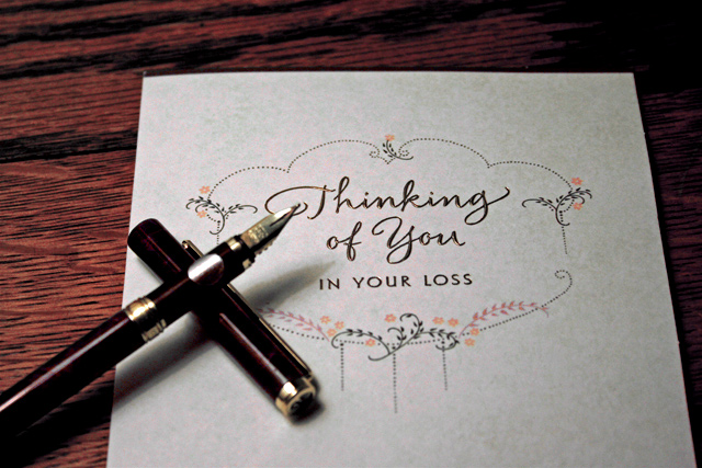
Great photo - but it would have had even more impact if the words were actually written in handwriting instead of being a printed card..or was it?
Post actions
Actually, this shows a beautiful piece of stationery, that is undoubtedly tied to an unfortunate event. the photo itself isn't the clearest, but it clearly conveys a message.
Post actions
Wondering if the image would have been improved by also having the pen in focus?
Post actions
Would have liked to see more balanced framing on this with less of the table above, and some showing below.
Post actions
nice idea, but needs more. casket in the background, etc. to make it really click.
Post actions
Post actions
I would have liked to see the tip of the pen in focus with the paper. The composition is well thought out and overall, this is a very nice image.
Post actions
Nicely done, the pen set up the way you did is an added touch that adds to the interest.
Post actions
An increased DOF where the pen is in focus would be better. Nice idea.
Post actions
I like the idea in this photo. I think the pen should be sharper, and the paper should be aligned better. The pen to me is a major element of the photo--but it's a bit frustrating to have it so out of focus in the shot.
Post actions
Oh such a sad letter but a pretty design.
Post actions
Post actions
interesting shot for a stationary catalog...
Post actions
Post actions
good job! personally i would have liked the pen to be more in focus.





 Add photograph to your favorites
 Add photographer to your favorites


 Photographer found comment helpful.


