I liked this shot very much! I think voters need to look into the creativity of the shots. This should have been higher in placing. Keep up the great work!
Trying to leave some more in depth comments on random photos, so here goes...
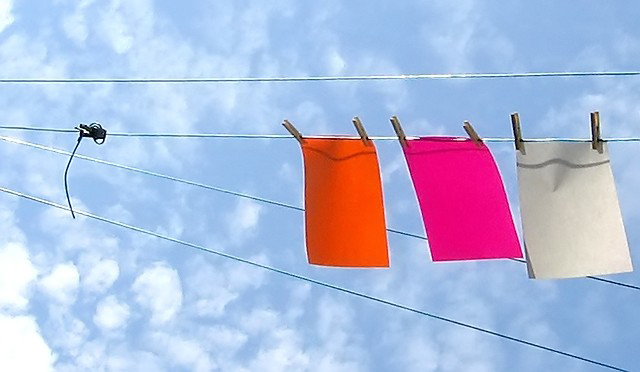
After looking at this one for a few seconds, I finally got why the title has the dashes in it... *groan*. Very clever! I like the composition here with the clotheslines going straight across and at the angle. The bright colors of paper are just enough in this shot without being too overbearing. You also caught some great clouds here which I think make for a better picture than a plain blue sky. Suggestions for improvment? The clouds at the very left of the shot seem a bit overexposed, and draw my attention away from the paper. Also, seems to be a bit of either oversharpening or compression along the clotheslines and on the edges of the paper. Nicely done!
I really like the composition of this, the colors and the sort of abstract qualities it has. Unfortunately, it seems kind of compressed, causing it to look pixelated and a bit out of focus.
Nice play on words. The shadow from the pink paper on the white paper is the only weak spot in this image. Waiting for the wind to die down or spacing the paper further apart might have solved this issue.
You managed a really good exposure on the sky. Great contrasting colours. My only qualm is the little black knotted thing. It destracts the eye away from the main subject, although I'm not sure how this image would work without it since it almost seems to keep the eye from sliding off the image when following the lines.






 Add photograph to your favorites
 Add photographer to your favorites

 Photographer found comment helpful.


