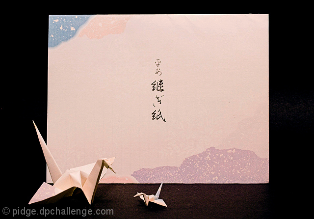
Ok. I am ashamed to admit I have no idea what the hiragana and kanji on the paper are, and I have no idea if tsuru is the right word for crane in Japanese. Oh well!
Here's to hoping I finish in the top 100!
Edit: Who would have thought people would be annoyed with a foreign language title? Live and learn!
Edit: The crane was made of the same paper as the stationary. The paper with the writing on it was the cover page of a pad of the stationery.
Ergo, paper was actual stationery, and crane was made from stationery.
Statistics
Place: 43 out of 122 Avg (all users): 5.5305 Avg (commenters): 6.3077 Avg (participants): 5.3214 Avg (non-participants): 5.5830 Views since voting: 917 Views during voting: 379 Votes: 279 Comments: 17 Favorites: 0
I'm not sure on your PP steps, but there looks to be two small issues. One, the big crane looks a bit blown in the lighting, but more importantly there seem to be halos (dark ones) around things. I'm not sure what that's from. It's minor, but it caught my eye.
5.5, in the realm of my critiques is a good score. Probably the biggest limitation was the black background. I normally dig them, but here maybe some additional context would have helped. It was a tough challenge trying to make paper dynamic, and the cranes certainly are a good idea, but the large piece is taken in by the eye but has trouble keeping our interest.
I usually read a ton of 5-6 scores as "technically well done, but doesn't keep my interest".
I gave you a 6. It just lacked that "punch" of a top score -- maybe if the paper had bolder colors, then it would have been more obvious the cranes were made from the same paper as well. Also the small crane is too small to be appreciated with the limited resolution allowed.
Better than a couple of other origami shots because it's much simpler. But here, I'd like the swans to be a different color so they pop out from the background paper.





 Add photograph to your favorites
 Add photographer to your favorites

 Photographer found comment helpful.


