OK, yeah, there are some problems with this -- but I like it. It certainly doesn't deserve to be this far down in the heap.
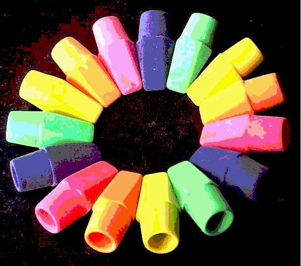
I think the biggest single thing that could have made it stronger would be a cleaner background. If that was a nice solid black, with the funky erasers on top (I like the harsh color transitions), it would have looked more intentional and less accidental. (Not saying the look was accidental, just that was how it was perceived.)
Those are really cool and fun erasers, and I like the idea of putting them in a circle. That said, I think you've been betrayed by your image quality (and possibly your lighting as well, if you were trying to compensate for it being dark). This file is 1/3 the size it can be, and the image quality is very poor, with the transitions between colors harsh and colors blotched together.






 Add photograph to your favorites
 Add photographer to your favorites

 Photographer found comment helpful.


