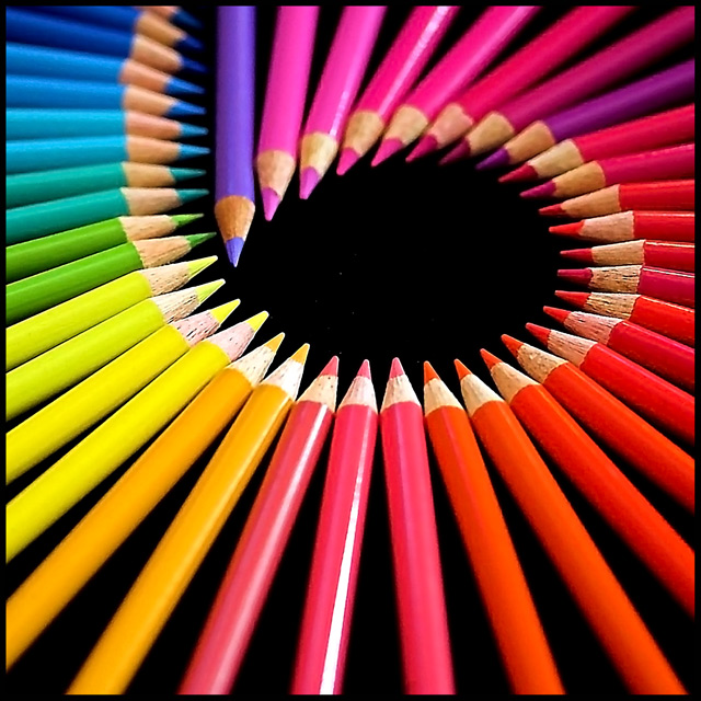
Another fun challenge arranging my colored pencils into a spiral, which formed the number 6. This is how I came up with the name of my entry "Six".
Shot in the "Raw" program, and edited in PS.
Thanks everyone for their vote and comments. I am very happy with 9th spot, and on the front page.....
I tried to make sure this didn't look like my other pencil shot, as I wanted a softer look, re the DOF, with my new macro lens which is working overtime.
Statistics
Place: 8 out of 122 Avg (all users): 6.3767 Avg (commenters): 7.1220 Avg (participants): 6.3148 Avg (non-participants): 6.3908 Views since voting: 3216 Views during voting: 513 Votes: 292 Comments: 67 Favorites: 9 (view)
Congratulations on top ten! Cool shot that suffered the same fate as mine...every ten would be followed by a 1 or 2 - killing the high score. Strangest voting I've ever seen but you gotta be proud with front page Baby! Way to go.
I was also very surprised by the number of "ones" and "twos" as well. Guess they either didn't like it, or thought I was some kind of threat, but I wouldn't hurt anyone. Thank you everyone, for your most valued comments, as I received well over 40.....
1 x 7
2 x 11
3 x 4
Originally posted by Penny Lane:
WOW sher! I didn't vote in this one but when I looked through this was the shot that stood out for me. I was looking forward to seeing who the photographer was. Well done, and to those people who gave you 1s, ba hum bug!
WOW sher! I didn't vote in this one but when I looked through this was the shot that stood out for me. I was looking forward to seeing who the photographer was. Well done, and to those people who gave you 1s, ba hum bug!
Nice composition, nice colors, nice black. Beautiful repetition. The sharpened end of the yellows and pinks are beginning to wash out and loose detail, also, harsh flash is causing reflection on the pencils to the front and back of the photo. Can you relocate the light source? Four white pixels in the black center don't do this photo justice. Otherwise beautiful.
I know this is not as easy to set up as it looks. The purple pencil at the top is somewhat distracting and really isn't necessary for this image to be effective.
Wish you could have gotten rid of those white specks on the black...they really stand out. I've seen soooooooooo many colored pencil shots that I was like...OH NO!! Not another one...but this one is nicely done. Creative!
[dnmc crap removed] other than that, good composition, lighting is a bit harsh, note the blown spot on the dark yellow, DOF should have been deeper if possible, perhaps change the angle up a bit to help with that.
My first thought was didn't meet challenge but I figured I had better look it up and see what the web defines as stationery and sure enough wikipedia widens my definition to include pencils so.....
Very good use of color but I would have liked to see at least the tips that for the circle in focus. 7
I really like this image. It shows a nice control of dof and colour use. I think the border of this image is tasteful and also very important in creating a "boundary" that ties in with the background.
Although, now that I go to click a score, I might warn you to rethink giving you images a number for a title, because my automatic instinct is to click on 6. Can you make those pencils into an 8 or something?? :)





 Add photograph to your favorites
 Add photographer to your favorites

 Photographer found comment helpful.


