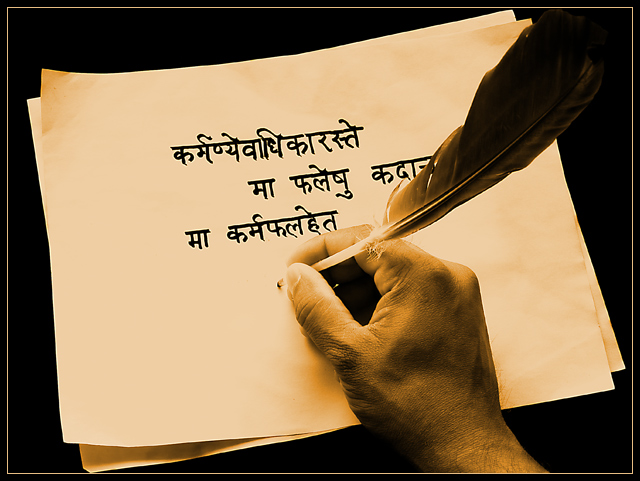
Processing: Channel mixer (80% red + 80% green - 60% blue) to convert to monochrome. Curves used to add contrast. Using color balance increased reds and yellows to give some sepia effect.
Post Challenge: This is a famous shloka from Gita in which Lord Krishna is motivating Arjuna for war. The language is sanskrit. Translated in english, the complete shloka means:
"Your freedom is only in the field of action, and not in the field of bringing about the fruits of action. Never take yourself as the cause of bringing about a karma-phala (situation), and never resort to a life of inaction."
I know this idea could have been executed much better by a better photographer. But, I am happy with 6+ score and 20th place. Thank you everyone for ratings and comments.
Statistics
Place: 18 out of 122 Avg (all users): 6.0105 Avg (commenters): 6.5217 Avg (participants): 5.6604 Avg (non-participants): 6.0905 Views since voting: 1058 Views during voting: 418 Votes: 285 Comments: 26 Favorites: 2 (view)
A little more attention with the lighting and this image would have finished much higher. However, the delivery of the image is great. Congratulations on your top 20 finish.
kteach: I fully agree with your observations. The finger does get lost in the paper. About the color: reducing the yellow was making the hand look like actual skin color and was not producing the ancient feel, but I agree that I need to learn sepia toning. This was my first attempt at making sepia.
lauralink: Yeah, it doesn't look ancient to me as well :) an older hand, and a better burning (not photoshop burning, but burning in oven) of the paper could have made it look ancient.
Commando303: You have it right.
Jutilda: I fully agree with you. It does need more negative space and a different angle.
once again, thanks every one for your excellent remarks.
Trying to leave some more in depth comments on random photos, so here goes...
I like the slight tilt of the papers in the frame of the shot and the duotone coloring, though it seems just a tad yellow and I might have made it a bit more brown. Considering that I can't read what is written on the paper, I think if I had been able to it might distract from the idea of the photo, so it was a good choice. Suggestions for improvement? Besides the possible change in color for the duotoning, it seems like the tips of the fingers get lost in the lighting, and I'd like to see a bit more definition there. Nicely done!
I understand tha a quill is a rather primitive tool, but it doesn't convey that the stationery is itself ancient. The photo is good, with sepia undertone, but it fails to match the "ancient" part of the title. There is also the fact that the photo captures the ongoing writing of the note, which is not an ancient event, but current for the photographer.
I like the idea of this alot. I wonder if you had a different perspective with some more negative space, if it might have more impact. It's a bit too centered for my taste.





 Add photograph to your favorites
 Add photographer to your favorites

 Photographer found comment helpful.


