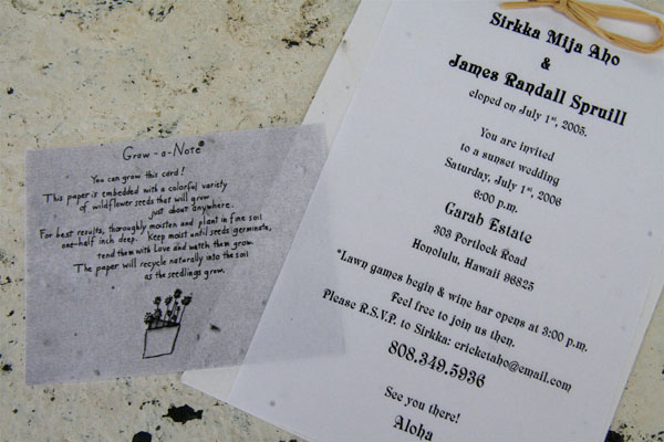
Interesting concept, if you can make out the additional note which describes the uniqueness of the stationery used; there is a bit of a disconnect with the overall photo. I think it could have been better conveyed.
The background distracts from the very nice arrangement you have put together. A little bit of levels adjustment would have helped the letters to pop a little more.





 Add photograph to your favorites
 Add photographer to your favorites


 Photographer found comment helpful.


