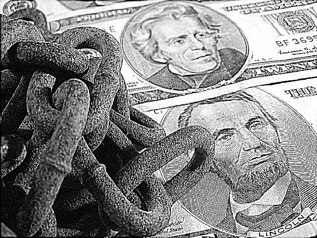
this is an interesting black and white... I love the composition, but it loosk a little over processed.. i'm not sure if it's sharpness or level adjustments... = 7 - jmsetzler
This would almost fit in with the corporate challenge too. As for the texture challenge it sure fits. Those old rusty chains...real good. A concept is expressed here and done well. Concepts are challenging and you pulled it off. Nice job!
Composition7 Originality9 Technical Aspects5 Meets Challenge7 Total Score7
For those that are just learning, like me.
Composition: Scoring in this area is based on basic composition of a picture and includes the rule of thirds, balance, cropping, and curved and diagonal lines. Subject matter that does not lend itself to the picture or otherwise unwanted is also considered here.
Originality: Scoring in this area is based on pictures or concepts that I have seen, as well as how much effort you have invested in the picture. Usually a little something that sets it aside from a snapshot. Does it make me want to come back for another look? You know things like that.
Technical Aspects: Focus, exposure, lighting, and other special effects (done by the camera), and post processing are all considered in this category.
Meets Challenge: This is based on my interpretation of if you, have/have not, met the challenge. This is fairly simple but quite important for this site.
There are many sites that can give you assistance in achieving better skills in photography, but I think the best way to learn is to take pictures and show them to other people. Believe me when it is a good one you will know it.
I'm going to tell you the same thing everyone is telling me....way oversharpened...but if that's the look you were going for, then it's great. I think it could have been better if it wasn't sharpened so much though. 5
A little too sharpened, I think. At least that is my impression of the links in the chain. Interesting symbolism. I like how you have framed this. karmat
looks like you cranked the contrast way up to emphasize the textures. I really like the idea, but i'm wondering if you cranked it up just a bit too high. the texture of the chains seems to have been turned into static. you know, you should do something like this for the corporata america challenge!
Nice idea. However, I find the img somewhat flat; not enough contrast and even though the chains have texture I don't find the object complimenting the dollar bills. Some smooth and highly reflective surface would have been better.






 Add photograph to your favorites
 Add photographer to your favorites


