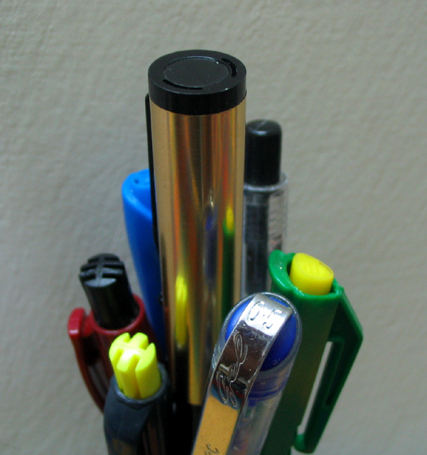
A little too soft for me. The leader is also not the main focal point as my eyes go to that bright shiny reflection on one of the subordinate pens. I do like the idea so here are some suggestions if you decide to reshoot in the future:
A.) Cleaner looking pens - too many specks on them and the "leader" pen could have looked more "brilliant". If the lighting was done differently (see below) I think that pen could have looked more shiny and stand out more.
B.) Cleaner looking background - The current one looks too muddy. Using a dedicated light source just for the background would help.
C.) Light the subjects from below and to the side and not from above or keep the above lighting but use it only as a fill light and not your main source. If that's your house lights then use a quicker shutter speed to reduce that lighting source or dim the lights a bit if you have that option but only if you are using other light sources like the ones mentioned above.
D.) Maybe use some more pens to fill the space on the left and right and perhaps make this a landscape shot? Including more pens would make it look more over the top which would help give this some added wow factor, IMO.
You need to play around with the lighting a little bit her to help give this image more definition and appeal. The background would improve considerably if it were a brighter white and the depth of focus is a bit too shallow on the pens.
Very heavily center weighted. I might have tried moving the background farther away from the subject in order for it to blur a little more outside the dof, and brought the pens all completely into focus. A little more light on the pens would have helped them pop a little more as well. For this type of "stock" photography, I would encourage you too look at different office product catalogs to see how they compose images of writing instruments, etc.





 Add photograph to your favorites
 Add photographer to your favorites


 Photographer found comment helpful.


