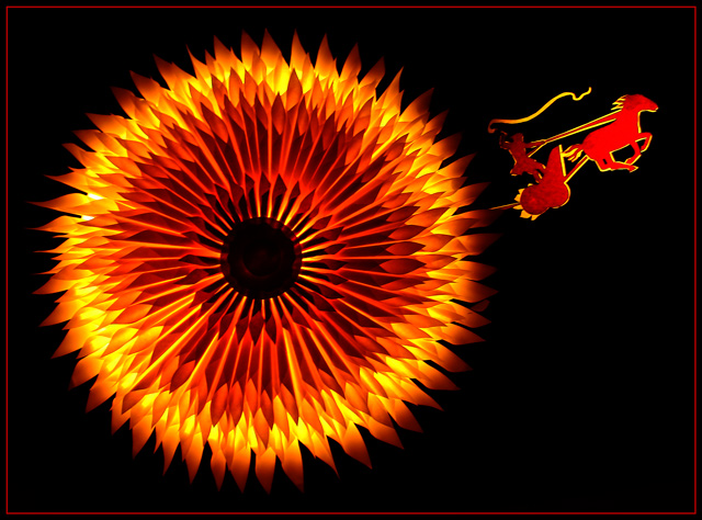
There was certainly nothing simple about this stationary shot! If I had known how long this was going to take to set up, I NEVER would have done it - but I'm very bad at knowing when to hit the "abort" button. The sun consists of rolled up tubes of light yellow stationery (originally intended to be a flower) with the center circle being orange construction paper. Same paper was used for Apollo & his horsey. I set the sun on top of a cylindrical trash can with a desk lamp shining up through the paper. Apollo was backlit with another desk lamp.
Crop, levels, sharpen, border, resize for web.
Post Challenge - WOW - I could not help but be struck by the voting spread here. Many high votes but overall an incredible quantity of very low numbers. I'm afraid this spread took a bit of the fun out of this challenge for me. However, I'm very pleased to be in the top 20. Thank you.
Notes: Although not a perfect representation, this was intended to be Apollo – famous Greek god in myths – driving the sun across the sky as a daily duty (so some of the stories go).
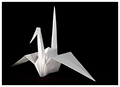
Here is a pic of the paper sun and Apollo in daylight.
Statistics
Place: 11 out of 122 Avg (all users): 6.2169 Avg (commenters): 7.4375 Avg (participants): 6.2778 Avg (non-participants): 6.2033 Views since voting: 3146 Views during voting: 564 Votes: 295 Comments: 50 Favorites: 9 (view)
i think i would have voted your entry higher had i seen it presented in lighting like the prop photo. i gave you a 5, because i, too, thought it was one of those fold out crepe thingies you get a party stores, so just like i would likely vote most statues or pictures of other crafty objects in other challenges, i thought it was sort of ho-hum. i felt you met the challenge because even though it may have been a crepe thing, it was still paper, which is all stationery in my book. it's a gorgeous work of art made with paper... i have a new respect for it now, but... and this is just my little ol' opinion, i wasn't a fan of the lighting or the composition... so with all of those things, that's why i gave you a 5.
I'm thinking the low scores come from those who didn't make the connection to stationery. I didn't vote this challenge; but upon opening this image, my first thought was that it was a well lit shot of something you purchased.
After reading about your set-up, I'm completely impressed. It seems apparent that you are the victim of "too much creativity". Hopefully this talent is more rewarding than a few votes from strangers on the internet. I see a definite trend in well thought out and unique images in your portfolio.
I didn't get to this one in voting, but I'm really impressed. It has an almost palpable glow to it. I would've picked it as paper art as the Japanese do something similar.
Unfortunately I didn't get the time to come back to this and comment before end of voting. However, I did score this an 8. It's beautiful. I can easily see the amount of time and effort you've put into it and IMHO, has paid off for you. What I find hard to understand are the dnmcs.
In light of the comments, I'd have to say that those folk probably didn't spend a heck of a lot of time looking at this image. A quick glance most likely gave an impression of party decorations, and so, they were unable to reconcile the arrangement with actual stationery...? Who knows. I'm just thinking out loud here anyway :)
Both yours and Tim's work are truly inspiring. Congratulations on your tremendous finish in the challenge! Best wishes to you both.
i'm no expert but i think this picture shows a lot of thought and creativity, it -to me-has good color-lighting and composition, which makes it a good picture. i personally don't think you should judge any of your pictures by the scores they receive here-i think you should judge them by how they make you feel,if you are happy with them then that is all that is necessary. the only other thing that would be important is if you were shooting this for someone else-then they would need to like it for you to have done a good job. too many people on this website are self proclaimed experts and judge pics by their standards of either limited or vast knowledge and many wouldn't really know a good shot if it hit them in the head.keep shooting what you like that is what is important.
But I have to admit, I don't see this as stationery, which should at least have something to do with writing or communicating. It's not "anything made of paper." At least, not to me.
Great idea and execution! The colors are just so alive and vibrant. INTENSE! This should ribbon right underneath a certain other shot. Great job Woman!!! Dont let anyone else tell you otherwise - and if they do and you find out who it is I will take care of them for you.
Are those curled post-it notes? Very impressive. I almost put this down as DNMC just because I didn't 'see'. Overall a lovely picture - I'd have given you a decent score even if it was DNMC. My only complaint is the slight blowout peeping out on the left of your sun. I assume this is your light-source. Would have been great to cover that.






 Add photograph to your favorites
 Add photographer to your favorites


 Photographer found comment helpful.


