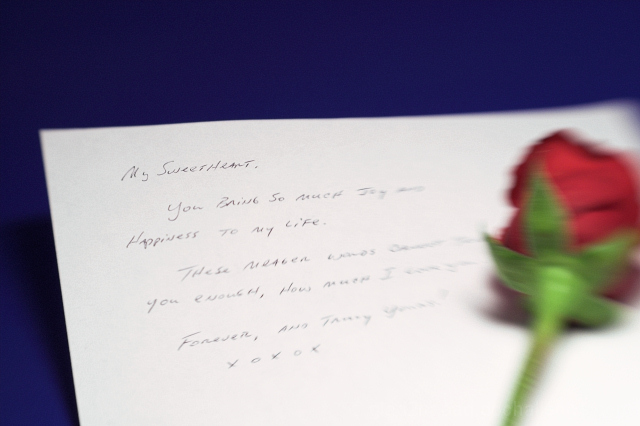
Interesting choice. I wonder what it would've looked like with blurred writing a sharply focused rose? It doesn't seem like the actual words are important even in this version.
Good representation. The bg looks somewhat unnatural, considering the type of letter - I guess I'd just expect to see it on a desk or a pillow, not plain blue. The motion blur on the rose is an interesting element.
The depth of focus in this image could use a little adjustment. I really want to read the entire message but can't. This forces me to look to the flower for a focal point and it isn't.
I don't quite know how you managed to make this image look the way it does, but I find the blurry rose (that looks like it's trying to escape off the page) to be very disconcerting.






 Add photograph to your favorites
 Add photographer to your favorites


 Photographer found comment helpful.


