Author Thread
Post actions
Comments Made During the Challenge
Post actions
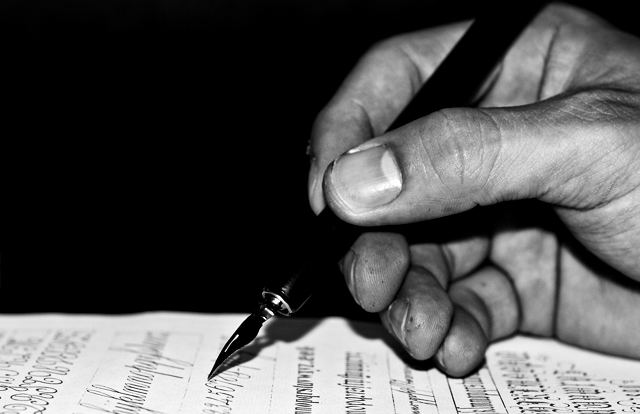
a little too centered, would have liked to see a little more paper toward the top. Other than that, excellent. Great detail on the fingers.
Post actions
Oh, I just love calligraphy!!! It is only slightly off the subject of the challenge though. Alas.
Post actions
I would have prefered the page half written, but then again it is a great tech picture. WEll done
Post actions
Post actions
Post actions
It would have gotten higher marks from me if the pen didn't blend in with the background.
Post actions
Great shot! Love the contrast in BW.
Post actions
The tip of the pen is tack sharp and well positioned. The hand appears to have ink on it, which doesn't translate to the paper itself. I would expect to see smudging on the paper since he is resting his hand on top of ink that transferred to his hand.
Post actions
Lighting could be improved. Too contrasty for my tastes.
Post actions
The black of the pen blends in well with the background. You might get some flames thrown your way because of that, but I kind of like it. 9
Post actions
Nice tones and great details.
Post actions
The lighting and angle seem to work against this image.
Post actions
Nice mooody use of light and dark. Well framed, too; though I would have experimented with having the paper at a bit more of an angle.
Post actions
Nice if a little faux. 8.
Post actions
I love that you opted to shoot this in black and white.
Post actions
i like the grittiness of it. the high contrast b&w makes it all the better!
Post actions
Wonderful focus, the highlight on the thumbnail keeps attracting my eye though... 7
Post actions
lighting is quite harsh and contrasty, sorry
Post actions





 Add photograph to your favorites
 Add photographer to your favorites


 Photographer found comment helpful.


