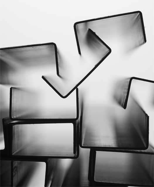
lit from below
curves for contrast / moved to B&W space
usm & crop
-second edit pull into PSCS & usm just a bit & save for web 'bicubic smoother' to get rid of jaggies
bit of a stretch conserning stationery -
but i've done paper ;) & wanted to do some thng else ...
--------
Post challenge:
Thankyou thankyou
a few other details
started at f8 but wanted to get a few staples detailed in
so cranked it up to f32.. and saw the bottoms of the staples which hurt the illusion so moved to 'inbetween' settled on f20 ..
original shots were all the staples lined up in rectangles but that was zzz .. acidentally bumped the table & reset them up where they landed .. & voila ..
what i like most was the gradation from dark to light bottom to top ..
thanks again..
Statistics
Place: 5 out of 122 Avg (all users): 6.5518 Avg (commenters): 7.8780 Avg (participants): 6.5536 Avg (non-participants): 6.5514 Views since voting: 4014 Views during voting: 539 Votes: 299 Comments: 56 Favorites: 21 (view)
What I like: i love the composition, texture, light, and DOF.
What might improve it: Might be better if it didn't have the junk on the edges of the staples, but in any case, I can see why you didn't remove it, and it might actually help the picture. This is a 10 for me. Great job!
Neato, I love the use of the thin DOF. Excellent PP as well, the haze is not at all gross as it sometimes can be. I can't wait to see how wide the aperture was (I'd say 1.4 if I was a bettin' man).
Very interesting perspective. Has an almost ethereal feel to it. The black and white treatment works great to play off the light and sihouettes. Bumping up.
Cool abstract. Well done. I like how the rectangles are pretty orderly towards the bottom, then get more disordered as you go up, until finally there's just white space at the top. Nice. Good luck in the challenge!
My favourite in this challenge! I never thought I'd say this in this challenge, but I could quite happilly put that on my wall:)) I bow down to your artistry. 10






 Add photograph to your favorites
 Add photographer to your favorites


