|
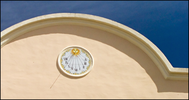
This is a very nice image but it just doesn't come across as strongly as it should. You might want to consider cropping about half of the negative space off the left. Something about the way the shadows end on the left side draws my focus away from the clock. I might also suggest playing with the contrast, levels or curves to darken the shadow just a touch and maybe lighten the sky. The sky being darker than the shadows makes the image look a little unbalanced. |




 Add photograph to your favorites
 Add photographer to your favorites


 Photographer found comment helpful.


