Author Thread
Post actions
Comments Made During the Challenge
Post actions
neat capture. i might have cut out the foreground and increased the contrast a bit (something i didn't do enough on my own submission).
Post actions
Seems a little soft, and right side of image detracts from the main concept. Neat idea though.
Post actions
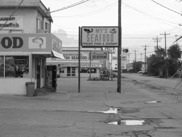
LOL...this photo is GREAT! a hell of a lot of seafood and power lines goin' on....
Post actions
This shot does have lots of repititions, but it is a very busy shot, and i think if the right would of been cropped more would highlight your 'seafood subject' more. just a thought.
Post actions
Great interpretation of the theme. A bit muted, I think, though bw does work better than color would.
Post actions
good interpretation of the category.
Post actions
Looks like the sign on the left also says "Seafood", so why didn't you pan over in that direction more, and not include the boring trees on the right?
Post actions
Very busy composition. Moving a little to the right and zooming in to capture the signs without the surrounding setting would help this image.
Post actions
I think you should have gotten a little closer and avoided having the puddles in the photo. A little more light would make it a better photo also.
Post actions
Umm...seafood district? Funny shot. Possibly would look better with the top power lines cropped out.






 Add photograph to your favorites
 Add photographer to your favorites


 Photographer found comment helpful.


