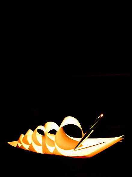
Nice lighting, nice use of space, great repetition, pattern etc. Nice contrast from a simplistic pattern. The red satellites on the pen could have been removed for an amazing photo. Very well done!
The form is interesting. I like the repeating and amplifying loops. There is a sense, however, that the highlights are blown. And I guess I don't get the great empty space at the top ( if the title is referring to the great vacuum of space, then we would be expecting to see the pen at some distance from paper floating in the blackness of space as in "Pen to paper, pen to paper. Come in paper. Over" )
Love this idea and composition. I've got the same edge jaggies on mine, but what can you do? Have no idea what causes it as I don't particularly over-sharpen my images and I suspect (judging by the quality of work), neither do you. Still, my vote is 9 :)
This looks rally well set up, and quite well lit. There's a bit of blooming on the end of the pen that makes me a bit uncomfortable, and a weird red streak about half way up that is quite hard to see...
You also seem to have encountered a bit of problems with the 'jaggies'.
Doing multiple resizes might help prevent this... I do mine in 5% increments via an action if it's not been cropped, but if the ratio is a bit different, I double check the last few steps by hand...
An eye-catching shot. There's a lot of empty space here, but I think it works (now I just need to work out why it works, so that I can start introducing space more effectively into my own shots...)
Effective use of light, too. Did you have the pen suspended on fishing line?
I like it but not sure that the composition works for this...I am one for using dead space like you have here above your pen and paper, but I reckon it would have been more dramatic to get in tighter and loose the space at the top...nice idea





 Add photograph to your favorites
 Add photographer to your favorites


 Photographer found comment helpful.


