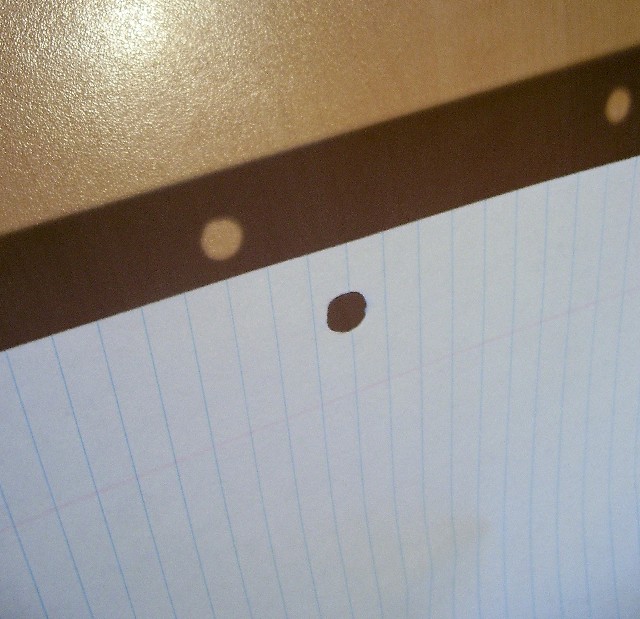
Woooo! This makes me kinda dizzy, but at least it is clearly a piece of paper to write upn; the interplay of light and shadow, substance and absence are a bonus for the viewer.
I like the idea. I find the glare on the wall rather distracting. And I wish the paper had no lines and showed more texture. Knowing I usually crop too tightly, I think the photo would be a bit better with some cropped from the bottom. Finally, I might have played with hue and saturation a bit. This photo might be better as a sepia or b&w to emphasize the form rather than the color - which is not that interesting.





 Add photograph to your favorites
 Add photographer to your favorites


 Photographer found comment helpful.


