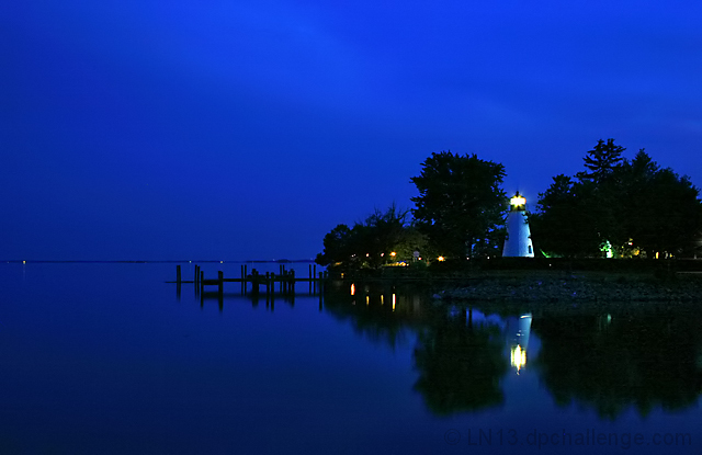
How many people will correctly guess that this is mine? This is my favorite vantage point.
Shot at 9:13pm, about 45 minutes after sunset.
Is PS CS2:
auto levels
rotate
crop
shadow/highlight (30,20,30,30,20,30)
Neat Image
USM (85,1,4)
And yes, the horizon is straight!
This is my entry in the 2006 county fair in the "Landscape with structures" category. It finished first in the category and was the Champion color photo at the county fair.
I have a better version that will be entered in the state fair, but I didn't have time to get it printed before the county fair. Look in my "Lighthouses" folder of my portfolio.
Statistics
Place: 15 out of 284 Avg (all users): 6.3288 Avg (commenters): 7.3846 Avg (participants): 6.0610 Avg (non-participants): 6.4857 Views since voting: 2083 Views during voting: 323 Votes: 222 Comments: 19 Favorites: 3 (view)
Here a few suggestions as per your forum post. Firstly, I really like richness, sharpness and tonal depth, the blacks are really dark without feeling like there is information lost.
Compositionally, it seems like you are going for rule of thirds by orienting the lighthouse on a third and having slightly more sky than water. In both cases, it feels like you are slightly more centered than on a third. These are only guidelines of course, but I may have tried to push the light house a bit to the right and add a little more sky in relation to the water. This seems impossible to do with a crop considering that the reflection of the trees would feel crowded if you cropped up from the bottom and the lights on the right would feel crammed as well if you cropped in. There is also something that happens on bad monitors when you have a gradient of rich blues (or any similar color.) I've noticed that the image can have these bands where the color jumps. I always like to test the image on a couple different screens because trolls with bad monitors will nail you for something like that. I've actually looked at all my top scoring photos and have noticed that they perform well on a variety of monitors. This sort of depresses me because I don't want photography to be about monitors and stupid stuff like that, but it may be what accounted for your 3 2s and 7 3s. Great shot, I'm looking forward to your future submissions.
Wow. Incredible colour. A great example of how empty space can balance heavy detail within a composition. The left of the frame is empty enough to draw the eye away from the trees and lighthouse and out onto the dock.







 Add photograph to your favorites
 Add photographer to your favorites

 Photographer found comment helpful.


