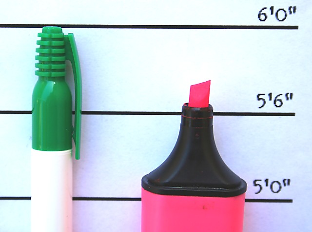
Interesting concept. The lighting on this photo leaves it a little flat looking. If you could have moved the markers away from the background some it would produce better defined shadows and help give the photo more depth. Another method would be to move the light to the right hand side of the pink marker instead of primarily straight on.
I like the creativity. And in fact I like the photo. I am sure you would disagree or you wouldn't have entered the photo in this challenge, but IMO DNMC.
although i'm thankful for the change from paper to look at--i spent way too much time trying to understand the title (that won't affect your score from me). this is an otherwise generally interesting picture. It seems a bit soft, and the numbers on the paper lack resolution with a slight tilt to the right. The colors are a bit flat as well. I do like the creativity.






 Add photograph to your favorites
 Add photographer to your favorites


 Photographer found comment helpful.


