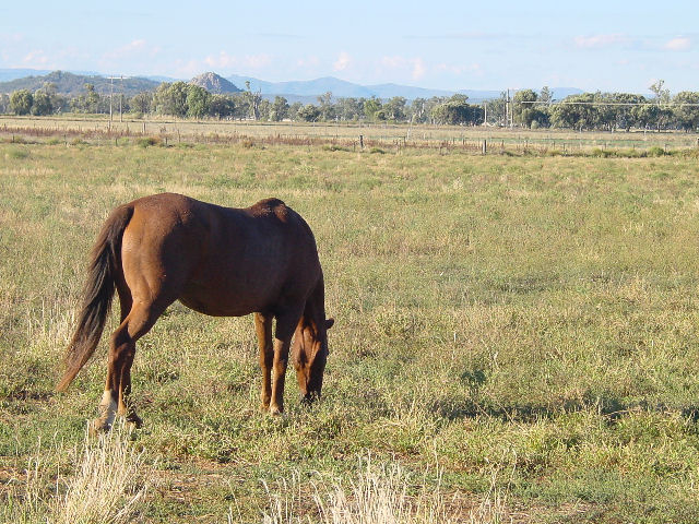
So if you'd been allowed to edit, maybe this could benefit from a bit of contrast/levels adjustment and maybe a bit of increased saturation. I think that the lighting may have been too direct, which is causing things to look slightly faded? Not sure. But I do like the colors, myself - I just know that voters like the vibrant saturated style a bit more.
One thing you may have improved while taking the shot was leveling out the... road? The line right under the trees. It doesn't look tilted enough to be deliberate but it's tilted enough to be noticable.
Things I really like - the shot has depth. There's interesting things in both the extreme foreground and the background, and they all work together and none takes more attention than it should. Also, I really love the positioning of the horse. Just a good pose for it, I think! |





 Add photograph to your favorites
 Add photographer to your favorites

 Photographer found comment helpful.


