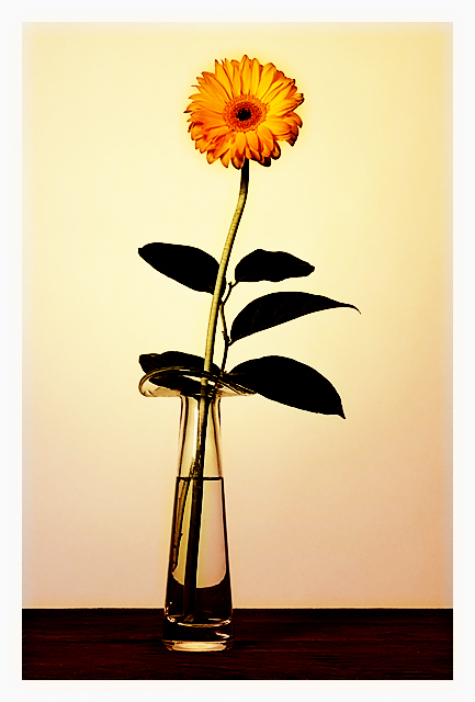
The composition here is inspired by Robert Mapplethorpe's truly beautiful "Flowers #3" (and only the composition, since there's no way to emulate that image). I love that photograph, and it's minimalism, clever lighting, and painterly feel. There is a softbox lighting the left side of this flower, and a strobe with a yellow gel pointing at a white paper roll behind it. Post processing is curves, plus some spot cleaning.
Statistics
Place: 76 out of 375 Avg (all users): 6.0609 Avg (commenters): 6.7500 Avg (participants): 5.9565 Avg (non-participants): 6.3051 Views since voting: 1175 Views during voting: 276 Votes: 197 Comments: 20 Favorites: 1 (view)
How did this get so many 4s and 5s? Even 6s?! If I voted, I would have given this a 9! It reminds me of a painting or something, it's really really different and pretty! PERFECT colors going on.
Hey Louis - I was one of your 8s on this shot. The lighting and feel set this apart from many of the regular flower shots. Nice subtle curve on the stem, the table offers good contrast in color to the rest of the shot and the curve that is made in the bottom of the vase is quite nice. And I dont miss the greens of the leaves at all. The darkness and lack of detail in them allow for a smooth picture with the focus pulling up towards the head of the flower. Great shot, good placing and a bit of a shame that it didnt score a bit higher.
This truly is art. As good as your score was (76 out of 374) it was still underated. I think this is your best work to date...I gave it an 8. The flower has as much emotional punch to it as any flower I ever remember seeing. The simplicity of the set-up is also powerful. I don't know much about Mapplethorpe (I saw one gallery exhibit of his work in Chicago some years back) other than his controversial nudity, but as I recall his technique is solid. So is the technique in your image. Well done.
Good to see a submission from you - it's been awhile! And congrats on a new picture in your top row.
I gave this a 7 in voting. It's a lovely, simple, captivating image and I really like the depth and texture of the flower itself. I also like the way the glass vase appears, with the water line echoing the table line below. Like the tonality and shading of the background as well. My only quibble is the solid, featureless appearance of the leaves. They don't need to be detailed, and for all I know Mapplethorpe's leaves all look this way, but the barest hint of shape and surface might be kinda nice.





 Add photograph to your favorites
 Add photographer to your favorites

 Photographer found comment helpful.


