Author Thread Comments Made During the Challenge
Post actions
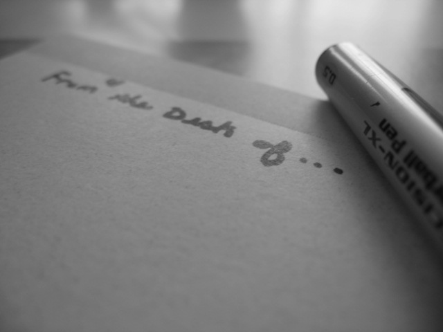
The view from having one's chin resting on the paper? It seems crowded, but at least is stationery.
Post actions
Very nice, would like to see writing be darker so as to junp out a bit more. Overall impression is not enough contrasts between grays, but do like the shot
Post actions
very flat image text should be in focus for me.
Post actions
dont see what the photo is supposed to convey. the title doesnt help indefining that either
Post actions
Post actions
A nice image but could use a little more contrast for my taste. The softness of this image doesn't really work due to the lack of contrast. The grain look is very effective.
Post actions
I like the softness and the tones. it would be a better picture if the writting was more in focus and the pen were more out of focus.
Post actions
Nice grey tones. Focus is good.
Post actions
Post actions
I love the simplicity and the texture here.
Post actions
A little too out of focus for me...





 Add photograph to your favorites
 Add photographer to your favorites


 Photographer found comment helpful.


