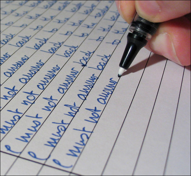
I was a bit disappointed with the ink splodge on this. Also it looks a little oversharpened in places and smooth in others.. This was in-camera sharpening that prevented me using a USM. :-(
I normally dislike taking studio sorts of shots, because I don't have the patience to take hundreds of them to get it right.. I'm fairly pleased with how I carried through with this idea however, despite obvious technical issues.
Statistics
Place: 25 out of 140 Avg (all users): 6.2071 Avg (commenters): 7.4545 Avg (participants): 6.1446 Avg (non-participants): 6.2982 Views since voting: 2435 Votes: 140 Comments: 13 Favorites: 0
Great idea for repetition. Shame that the pressure on the pen adds an unattractive yellow colouring to the model's hand. I'd have done the shot while holding the pen lightly. 6
WOW...great job. Only photo concern would possibly be the blurry "I" up front... borderline distracting for the eye (no pun intended). Beautiful handwriting though (pen and paper too). Amazingly neat, uniform, and "repeatably" accurate. I'd need a printer and a fancy font to even think of doing a shot like this myself. I'm wondering though if the writing is almost too professional for this? Love it visually, but really changes the context from the classic 'school/teacher' feel. Wondering if you meant to do that, and if there is some other statement being made by using obvious adult/professional handwriting in pen.
very cute! I'd like this better with pencil and a child's hand & handwriting, or old-fashioned fountain pen with old-fashioned handwriting, but it's funny and nice composition/focus :)





 Add photograph to your favorites
 Add photographer to your favorites


 Photographer found comment helpful.


