**Critique Club**
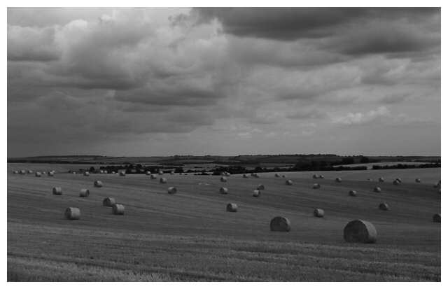
First Impression: Very dark, and that made it take a few seconds to see the hay bales, which I'm assuming is your repetition factor here.
Composition/Technical: Again, it's dark. I agree with the comment already provided about cropping this slightly higher on the bottom, although I think a greater effect would be to crop some of the top away. Given that you provide no explanation of this photograph, it's difficult to discern what you were really going for here.
Overall: If it is the hay you were shooting, it captures the essence of the challenge. However, as it's difficult to see, judging the quality of the repetition portion of the photograph is tough. Good effort.
Thanks for sharing, and good luck in future challenges. -Steve
I'd try cropping a little more from the bottom, to just under the first roll. Don't think it has to be so dark and gloomy on the ground, but the clouds look good.
Nice sky, I like the range of tones here. However, the horizon is unimaginatively placed in the middle of the picture which doesn't work well too often, and I think that there needs to be something more in the foreground to sustain interest. 6
The seemingly random placement of the roled bales on the ground and the cloudy, but not all dark sky provide exactly what is needed to render such a serene and pastoral lay.
The image is a little dark, perhaps, more suitable for an etching, IMO, than for the purpose here, particularly with respect to the highlights on the bales. With the horizon almost centred, a static quality has been introduced, for which I can find no purpose. The soft focus chosen here, I feel, is a debatable, but probably a deliberate choice based on a personal aesthetic.
All in all, a beautiful photo approaching the c l a s s i c.
When I first saw this pic I thought of a website I had looked at in considering repetition //www.photofocus.com/zine7/dejavu.html
However I like that this one is black and white. The only thing that bothers me is the blaes of hay that are on the left border - being cut off. Would have preferred either to see it in total or not at all. Good job.
this is a beautiful photo, but your choice of underexposure doens't seem to work well for me... I would definitely believe that this would be a much stronger photo (IMO) with a stronger tonal variation.







 Add photograph to your favorites
 Add photographer to your favorites


 Photographer found comment helpful.


