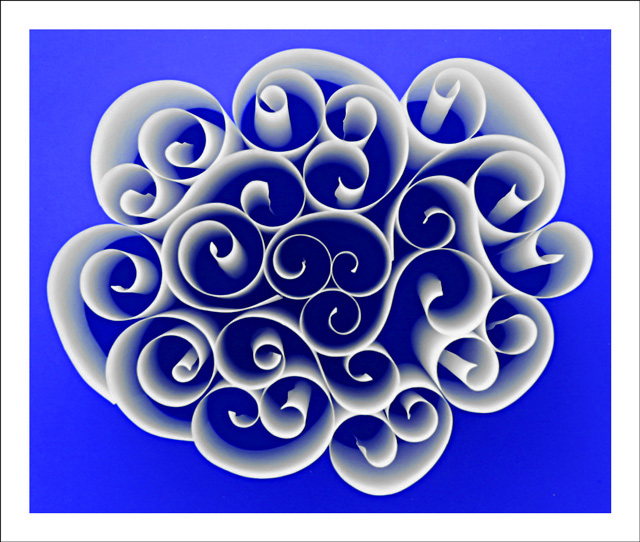
Tried a variety of different setups on this one. First round I had a big chunk of sensor dust. Already tossed all my paper swirls so I had to start over again. This is from the second round. The third round I shot indoors and the lightnig was not as even. This shot was taken outdoors just before the sun came up over the trees on a red sheet of poster board. The paper swirls are about 4 inches tall. I was going for a cool abstract shot. I hope this pulls me out of my low to mid 5 score slump. And if by some freak chance I ribbon on this one then I dedicate it to kiwinick and his wife of 40 years. Way to go!!!
Post process - crop, levels, hue adjustment, separate channel saturation adjustments, unsharp mask, gaussian blur, neat image, border, resize for web.
Post Challenge - Thankyou everyone for bestwoing me with one more ribbon. I thought I had something good right of fthe bat but you just never know how somethings will be recieved. Thankn you all!
These are some of the other colors that I was contemplating using.
.
Statistics
Place: 1 out of 122 Avg (all users): 7.1848 Avg (commenters): 8.1200 Avg (participants): 6.9138 Avg (non-participants): 7.2490 Views since voting: 17372 Views during voting: 596 Votes: 303 Comments: 97 Favorites: 56 (view)
Love the shapes of the paper curls. They swirl and curl and not only captures the eye's attention with shape, but coupled with that beatiful blue hue the mind becomes enchanted. This image is very visually appealing. Upon viewing the photo the viewer is easily entranced and can enter a daydream state very simular to laying on a grassy hillside and gazing up at the white clouds that drift by.
Congratulations (obviously) on your ribbon and 7+ score. What I especially like about this abstract photo is the negative space and the subtle color shift of the blue areas as you move out of the center (darker) to the edges (lighter). I also like the "fun" aspect of this photo...it's almost like looking at a maze (except there is no way out). I didn't vote in this challenge, but since I like abstracts I would have been right up there with the concensus of the voters. Well done.
First and foremost, congratulations on the blue and the 7+ score! A lovely composition and very creative use of paper. Needless to say, I think it met the challenge. What interests me most is the post processing - I like the use of blur here, and the changing of the background color is very intriguing. I actually prefer the composite with the different background colors - looks like a Warhol kind of thing. On the "I'd probably have given this a 7" side of things, this strikes me more as graphic art than a photograph. I've no doubt it would sell very well as a stock photo/graphic art piece and you may want to look into that. But my favorite photograph on your top row is still your first Kermie, with your second Santa Maria very closely behind it.
Awesome Job! The composition is just brilliant! Congratulations on not only a artistically and technically excellent photograph, but on a great work of art!
This is really pretty. I like it in all the colors. I wonder how thick the pieces of paper were. I already tried something like this and it didn't come out well at all. Now you've inspired me to try again. Congrats.
Hey.. you tricked me.. I thought it was a trashy shot of something fake and totally not of this challenge when I looked at this through the thumbnail. Now that I've had a look at it.. Its good...Really I mean you did win the challenge but now you've got one more fan of this pic
Uber-sweet, Tim! Knew it was a winner moment I saw. As for the other colors - offer all for sale so everyone can choose their own, its a great sell-able shot for offices, etc.
I simply love the balance here. There isn't much that can be improved upon. Perhaps I would prefer it if the background colour was lighter (although perhaps not).
This is very nice idea...I like the colors and shapes. Only thing that the border could be bit more descreet...takes too much attention out of picture.
This is a beautiful photo. It is difficult to get a sense of size, as quilling paper is usually small in scale, but this may be made of larger sheets... Unfortunately, this is hard to connect with the subject of the challenge.
Lovely abstract pattern. I like the blue gradient effect from the center outward. I'm not generally a fan of borders but when they work, they are usually smaller and less obtrusive than this. (-1 for the border) Otherwise among my favorites and a possible ribbon winner. Congratulations on a great photo!
An interesting idea, and you have some nice shapes here, but this image is very difficult to look at for more than a moment because the blue is overpoweringly blinding. The boarder seems a little overdone as well.
saw the thumbnail when I first had an overall look and this really stood out, well done, love the idea and the result...perhaps my only negative is the thickness of the frame...perhaps if it was narrower it would have been better...that coming from me who hardly submits a shot without one :-) good luck, I hope you do really well





 Paper Patterns
 Add photograph to your favorites
 Add photographer to your favorites


 Photographer found comment helpful.


