straightened, cropped, fade correction, edge enhance, highlight/midtone/shadow, automatic saturation enhancement, using basic editing rules I desaturated a bit of just the red in adjustment layers, neat image for noise removal, and last a full photo clarify #5 to brighten it just a bit more, then I added a border, resized, and saved for DPC
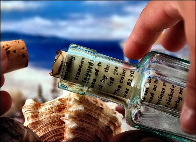
I really like this shot. I think it's a little bit different from your regular "message in a bottle" type shots. I love the colors and the story. The message inside can be read to reveal words like treasure, coins, $2,500, picked up, and lucky. They all go with the story of the photo which is finding a treasure map in a bottle on the beach.
This was all done in my light tent.
My props:
1. I was on my way out the door to find a corked bottle I wanted to use when I realized that I had one in my bathroom. It held scented oil and I never used it. It was old and just used for decor. I emptied the contents and put it in my dishwasher and that part was done and ready to go.
2. The shells. I have a bunch of large shells for both bathroom decor and my hermit crabs. I love all the shells. They are gorgeous. I used some big ones to prop up the bottle.
3. The map. I had this treasure map left over from a local public event. I cut a piece of it off and burned the edges with a lighter to give it the feel of a real treasure map. Thankfully it was already the perfect color of paper and the print was great. I rolled it and positioned it in the bottle to reveal the words I wanted to show.
4. The backdrop. This is a picture I have hanging on my bathroom wall. It is only about an 8 x 10 in size so I had to position the scene properly for decent DOF. I am not quite liking the gazebo on the right but it's ok. It kind of looks like I find the bottle on an upper sand dune.
I set my camera to the proper settings after a few test shots and was ready to go. I really didn't like that just the paper was sticking out with no cork, but I wanted the singed edges to show. To get the cork in the shot I thought to make it look like I just found the bottle, popped the cork, and was picking it up to pluck out the map.
I hope I did a decent job. You never know what appeals to the mass crowd here, but I do hope this one was enjoyable. Using the photo rather than a real beach was only for good background color purposes. The cloudy skies here in Florida lately aren't ideal for color, and the ride to a beach is a bit long on these hot days. Hot days make for hazy beaches here so for good color I chose the photo.
Disqualification Details
Multiple accounts are forbidden.
Statistics
Views since voting: 1358 Views during voting: 433 Comments: 36 Favorites: 0
This looks terrific! Very nice how you used the props.
I think it meets the challenge fine; I voted highly for just about anything related to communications. I missed this one, but it would've been high, too.
Nice photo, but it stretches the point so as to be only distantly related. The title helps to connect the subject matter to the challenge, but I find it still an awkward connection; the focus of the challenge is not the type of correspondence, but on the stationery itself. Maybe I'm just overly critical...
Very well done! Colors are crisp, image sharp, and overall composition is interesting. Including the hands opening the bottle was a good touch. Hope to see this in the top 3. 10
The composition of this image is very busy looking. The shell in the center is competing with the message in the bottle for my attention. The backround going from light to dark to light at the top also distracts from the main subject. The choice of font size for the message is spot on.
I love the idea. Photographically speaking the execution is superb. It seems like it ought to be a quibble, but I really find the font on the document to look too anachronistic. The message in a bottle is a seventeenth century thing, isn't it?
If only people could still write cursive copperplate! (rather than reach for the laser printer and computer....). I like the compositioon, the colours, the message too. Very well done. 8 for printing (9 if it was written).
Nice capture. I had this exact idea though I didn't execute it in my mind as well as you have captured it. Well done! I like the hint of text that is readable, hopefully others can realize that as well.
The only thing I would change is the lighting on the shell and glass. It does not seem a natural warmth compared to a beach shot lighting. Maybe try filtering the light with cloth/paper over the bulb to disipate it?





 Add photograph to your favorites
 Add photographer to your favorites


 Photographer found comment helpful.


