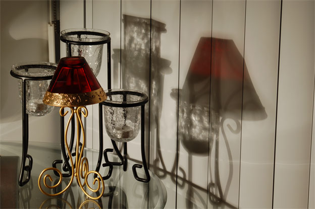
This is one that looks much better than the thumbnail would imply - let's hope people look. The shadow on the left side unrelated to the items on the table is a bit distracting.
I like this concept AND the composition. my only critical comment is that it would be tons better without the shadow on the wall in the left side of the pic. its not coming from one of those lamps so its very distracting and darkens that side too much.
The candle holders nicely accent each other. I like the reflective table also. Although the shadows are interesting, I think the composition might be stronger if you cropped off the right two shadows.
I like the look of the glass shadows. I think I would have liked to see the background either all blind or all wall. At the moment the transition on the left is a bit distracting. I like the splash of red. All IMHO of course.






 Add photograph to your favorites
 Add photographer to your favorites


 Photographer found comment helpful.


