Author Thread Comments Made During the Challenge
Post actions
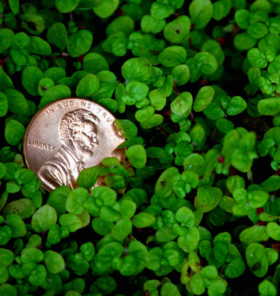
Splendid idea. Just wish the penny was a little sharper.
Post actions
Technical: Focus - 0 seem a bit soft to me
Post actions
Post actions
luv the photo composition and lighting
Post actions
This is a visually appealing depiction of the theme you've chosen. Nicely done.
Post actions
The lighting seems a bit too harsh here, it robs the coin of it's interesting details. I like the placement of the coin though.
Post actions
Good work and clarity on the coin.
Post actions
Post actions
Nice photo. The greenery is a nice deep green. Composition wise I would prefer the penny moved up a bit or have a little cropped off the top. It also looks like the penny is a bit blown out in the bright spots which doesn't work for this shot.
Post actions
Nice idea overall, but I think a little deeper DOF to get the greenery in a bit more focus would help. Who knows, though, maybe that would be lame.
Post actions
Post actions
I like the colors. It looks a little blurry on the bottom and sides though.
Post actions
the gren is too out of focus in my opionion... and the copper with the green doesn't make the best color combo
Post actions
This is a pretty picture.
Post actions
Nice shot...if the peeny was in a bead of clover you couls have killed to birds with one stone...lol
Post actions
I must say best one of these Ive seen so far
Post actions
Post actions
Nice idea, and the penny looks good. I think you could have selected a better background for it, or got the leaves in better focus.
Post actions
Nicely done on the focus and I like the choice of where to place it. It doesn't possess a ton of "wow", but still a worthy effort. 6
Post actions
nice lighting on the penny.
Post actions
Nice compo but maybe a bit too rough. 6
Post actions
Nicely done. borders are usually questionable but i think this one would have been helped by a border.
Post actions
Cute concept, to much light on the coin, but the rest balances nicely.





 Add photograph to your favorites
 Add photographer to your favorites


 Photographer found comment helpful.


