Author Thread Comments Made During the Challenge
Post actions
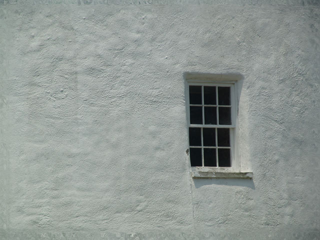
I like the simplicity of this shot. Texture of the wall adds interest. Focus and DOF could be slightly better.
Post actions
Nicely simplified and love the composition, just think I would have liked it heaps more if the contrast were boosted up, seems a bit flat as it is now.
Post actions
very simplystic, but I miss a spark.
Post actions
While like this style of composition, I don't know that this strongly says "glass" per the challenge topic. Nice exposure to bring out the texture of the wall.
Post actions
A little more cropping and a border would have helped frame the window a some more. :)
Post actions
the composition in this is o.k . The window does not to seem to be in sharp focus though. 5
Post actions
Nice use of the rule of thirds
Post actions
Nobody will agree with me but i like it. ta heck with the rest of ya
Post actions
Great light and time of day.
Post actions
ok, but there's nothing that grabs my interest.
Post actions
Nice use of negative space.






 Add photograph to your favorites
 Add photographer to your favorites


