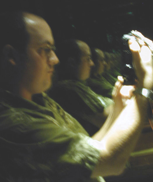
concept was good - but I think it is too blurry. Also, the white areas on the right are distracting - I think they call these hot spots. I would try this again experimenting with different lighting. The angle I think is right on. Just my opinion:)
Hmmmmm, I think you should reconsider what you enter. This is so blurry and shows the photographer that no matter what the subject matter, you're going to get a slew of ones and twos. That could be construed as repetition though.
Yep, repetition, but unfortunately, while the idea is really good, the execution leaves some to be desired. It's very blurry (some motion blur) and misses focus. Plus, the light on the arm is too bright. I do like that the Richie's seem to go on forever :)




 Add photograph to your favorites
 Add photographer to your favorites


