I wouldn't worry about the low votes. You have some good comments. I didn't vote in the challenge however, I would have given this a 6.
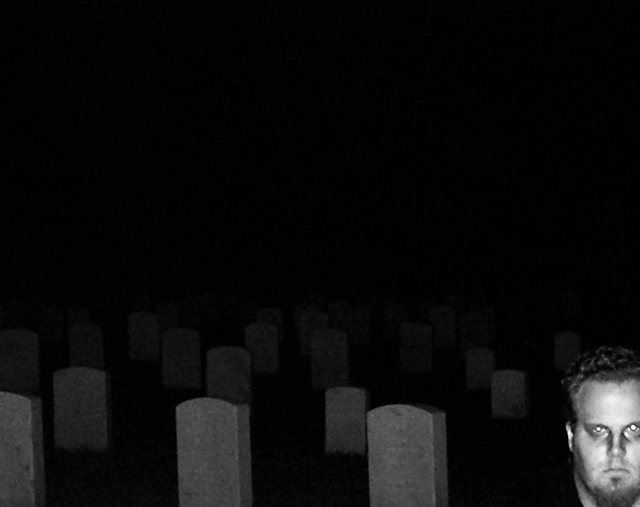
I like the idea and the photo. However, I think you may have gotten a low score because of the eyes and the fact that it does not "invoke" a "true" uban legend.
I would keep trying if I were you! I have some very bad challenge entries!
I won't change a thing in regards to composition, though I agree that it is extreme.
Here are a few suggestions that would help it score better. (Not necessarily make it a better pic.)
There is quite a bit of noise in the image. (Use noise reduction in PS or Neat Image)
Red eye/blown highlights are always a killer (I know it lends it's self to a ghostly look). Often, I submit an image I'm really happy about and I have suppressed the fact in my mind that the blown highlights matter. Even though I selectively choose to ignore them, voters never do.
The focus on the man in not dead on. You could try to save it with a sharpen tool, but in general, if it is not tack sharp, it probably won't do well. This continues to agitate me for two reasons. 1) why does everything have to be sharp. Common on people, lets have some creativity. 2) (The real reason) it is really difficult to do and I often miss a perfect shot because I botched the focus.
All in all, you have a great eye and the image is a testament to your creativity. Just keep shooting!
You got my comment in the challenge. ;) I think the composition was a bit extreme. It would have been better, IMO if the subject's face were less blown out from either flash or prolonged exposure. I do like the way the markers and the head form a pattern. That's a nice touch.
I really like how the tombstones look especially how they fade off. Very eery. I agree with crayon about the face. I'd think about trying longer exposures here. If you're just using flash maybe fire it without your main subject in the shot to get the lighting on the tombstones then while the shutter remains open have your subject move into the shot and do his thing. If this place is pitch black maybe take a flashlight or two and use it to "paint" the light on him and if you add some movement to add motion blur you may just get that ghostly look you were after here. Another thing to consider is adding something that makes it "easier" for the voters to understand like say flowing white sheets and the like. Voters are like little children who need things explained to them very clearly. This is why they also love bright shiny things like how so many on the front page look like. :) Now you may not always want to cater to that artistically so the question is how mainstream you want to go to appeal to the voters. If you can find that balance your scores will go up.
Anyway, just some thoughts. I know your scores will improve but better than that I want to see you grow as an artist and you will. Just keep it up!
OK, I like the shot, but my monitor is pretty accurate with rendering full tonal range. You don't get that luxury with a lot of voters. You risk a lot with a photo like this where most of the tonal range is dark. Some voters just can't see it. It has nothing to do with your ability.
It's an issue that stings a lot of low key images in voting. I love lowkey lighting, but steer away from it here to avoid those low votes from "blind" voters.
I did try to get his face more transparent - tried a whole bunch of different shots. That just wasn't working, though.
Update to reply to your update: Yup, tried that. Tried everything. Was totally not working! I think with more practice or a better flashlight or something, I would have been able to get the result I wanted... it did not help that the floodlights that are always on in the cemetery happened to not be on that night - I was counting on them, silly things!
saw your forum post and decided to comment:
I love the graveyard, the overall atmosphere of the image, but I dislike the way the guy's face (the ghost) reflects the light - it's too "real" to appear like a ghost (though his expression is good). Just a small suggestion, but if the face were to appear somewhere further from the camera, say among the tombstones, it would be much more spooky and convincing. Well, just my 2 cents. Cheer up, k?
UPDATE: to get a softer light on his face, try using long exposure on the entire scene, and use some external light to light up his face ;)
Nice use of the red eye effect. I also like how the we can see the headstones fade away into the night. Is there a reason his head was chopped off along the left side?
Composition really doesn't work that well for me - too much dead spaces (no pun intended). I think you could have gotten this same idea across visually without so much detailless shadow space. Choice of B&W was good.
the ligthing is far too harsh on the face. the concept is nice, it could have been much better though. especially if you covered the lens during the exposure had the model stand fully in the frame and then exposed him very quickly to create the ghostly effect. the light int he eyes is a nice touch though
Not sure I understand this 'UL or S' Don't really care for the model being so opaque. More transparent on the model. Maybe a lower angle on the stones as well so not so much white area on the top.





 Add photograph to your favorites
 Add photographer to your favorites

 Photographer found comment helpful.


