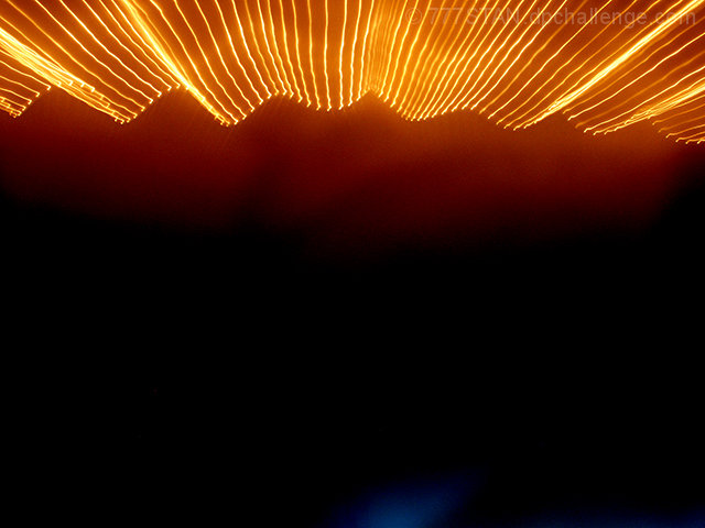
resized, enhanced contrast/lighting/saturation, rainy day motion practice
This was not my best work and I considered not even entering the contest.
(I enter contests often because I want to stretch myself & because I know that there are world-class photographers in residence at DPChallenge and I have a passion for learning from you...to the degree you are willing to teach me.)
I was running out of time that Sunday afternoon because I couldn't settle on a subject & set-up. This particular photo has a lot of negative space because I was trying to include a reather large "arm" of a climbing rose bush that (as you can tell) didn't show up in the blur.
I also tried to zoom in & out in several photos on hydrangea blooms as well as nice groupings of roses. Nothing ever satisfied my own esthics.
So, after working for a couple of hours, I looked up at the clock, gasped & through this one at you at about 11:50 PM simply because I liked the colors best & it was the one that made the most sense. Tee Hee...Go figure! SOL! X}
Statistics
Place: 161 out of 177 Avg (all users): 4.4892 Avg (commenters): 5.6000 Avg (participants): 4.3521 Avg (non-participants): 4.5739 Views since voting: 1053 Views during voting: 309 Votes: 186 Comments: 12 Favorites: 1 (view)
My 500th Critique Club Critique! Yay.
Anyway, I'm not a huge fan of abstract images, so this doesn't impress me on a personal level, and since you didn't post your intentions for the photo in the photographer's comments section, I can only offer my critique based on personal opinion alone, since I have no clue what your intentions were.
You state that it was 'practice'. Practice for what? What were you trying to achieve here? If you were ONLY trying to achieve Motion blur, well, I think you got got it, but motion blur might be one of the easiest things to photograph. It's making it look good that's hard.
I think that not having anything in the image to really hold our attention hurts it. We look at it, say 'oh, some blurry lights' and move on.
I do like that the subject is not directly in the center of the photo. That I think was a plus for this image. Although I'm not sure what was outside the photo on the top, I assume that it was better cropped the way you have cropped it. However, I think one commenter mentioned the blue color at the bottom as being distracting, and I'm going to have to agree. With all the negative space at the bottom, my eyes want to see it all one solid color. The only way it would work, is if the blue tied in with the subject somehow to help enhance it, but I don't feel that the blue adds anything to the photo as is. At this point, it is just a distraction. Not sure cropping it out would work though, since then it would be almost panoramic. So I think the only reasonable solution there would be to reshoot and make sure that blue light wasn't there. Cover it up maybe? Put something over top of it?
The motion blur is nice and crisp. Haha. If that makes any sense at all. What I mean is that the light trails are sharp, and not fuzzy, which is also a bonus. For an abstract, I think you did an ok job. I mean, while it's not really my thing, it IS better than some I've seen.
Kind of hard to critique an abstract, since the technicals kind of go out the door, but I hope this helps in the event of a reshoot, and remember, this is just my personal opinion. If you like it, that's all that matters.
~Heather~




 Add photograph to your favorites
 Add photographer to your favorites

 Photographer found comment helpful.


