Almost at the deadline, can't write a decent description. I spent a long time thinking and did this really quick in the last minute (self portrait), not expecting a high score, I know I could have done better if I had had more time.
Statistics
Place: 38 out of 177 Avg (all users): 5.9427 Avg (commenters): 6.8824 Avg (participants): 5.7564 Avg (non-participants): 6.0702 Views since voting: 1026 Views during voting: 374 Votes: 192 Comments: 21 Favorites: 0
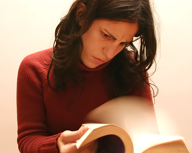
First off let me say that you easily met the challenge and in a different way than many of the others. You have a great idea here. The blur works great with it being nice and smoot. And the clarity and focuson you is good too - nice that there is very little blur if any on your face and body. Your expression lends well to the title and action at hand.
To make this shot better IMO - the colors and lighting seem a bit flat. Better lighting or maybe even shifting to black and white could have helped this image stand out better overall. Maybe a darker background to highlight the edges of the page blur could have helped as well. But - for a last minute shot and entry I think you did great. a 5.9 is nothing to complain about and replacing a pic on your highest rated row is what we all strive for in the end anyways right? Good job.
I think this is a great idea for a "blur" composition. With a little bit of work, the "great idea" could become a great photo. A few things I'd look to improve:
1. Framing: the 2 main elements of the photo - the book and the face - are both a little out of frame. I would have made sure that all of the book, at least, was in-frame.
2. Lighting: the lighting on the face is a little flat. I'd have tried to get a little more contrast happening on the face.
3. Focus: the crispest, best lit part of the composition is the shoulder; well away from what are (I assume) supposed to be the main elements - the face and the book. This draws my eye away from the main elements.
Don't get me wrong, it's a gresat idea, and there are some very good elements in the execution. The blur of the pages and the lighting on the book is well executed, and the expression on the face is just right. If you'd got a better result in the other areas that I mentioned, it would have been great.
Oh come on, that's easy. I'm now reading War & Peace by Leo Tolstoy. That's like 800 pages with letters the size of the letters you see on the buttons of Nokia phones. :)
I like the originality of this, I like how everything else is clean except the motion. My only complaint is the fading from white to slight pink at the bottom.
The look on her face is priceless, and you did a good job of using the motion blur as a storytelling element. The colors are kind of washed out, though, and the cropping is so tight her face is a little too high. Still, a 7!





 Add photograph to your favorites
 Add photographer to your favorites

 Photographer found comment helpful.


