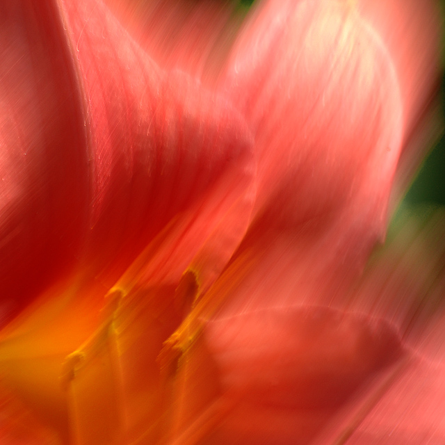
I think this is an outstanding image. The colors are just beautiful..It would look just awesome hanging on a wall. I wouldn't even give the score a second look. :)
OK Steve, just ignore the score on this one and never look at it (the score) again. I love it. You know as well as I how literal DPC is in its interpretation of challenges. "But the flower wasn't supposed to be moving."
Finished right ahead of you with a similar idea. Thought it was enhanced but got comments like racing flowers and Really fast flowers! Nice colors? I think this is a lot more effective than mine as the camera pan gives the image a painterly effect without a filter. Great stuff! Going to try it again? I am.
This is a very nice abstract. A nice, soothing soft feel. Great colors, I like the touch of green with the red, adds much to the shot, IMO. Composed well, and good lighting, there is enough shadows/dark areas to add to the nice flow of the image. There is a nice corner to corner travel across the image. Nicely done.
Yes, Neil is the abstract master, isn't he? :-) I find him very inspiring and a good critic of the genre. I too wish there were more people that liked a good abstract, I love 'em! I've submitted a few, only one that did well at all was 'Saturday', in the last 'Abstract' challenge. I always get amused by the "I can't tell what it is" comments. :-) I mean, c'mon, it's obviously an abstract, you don't have to know what it is...
Anyways, nice job on this one. Anyone that does appriciate a good abstract I'm sure will like it!
I've given the same basic comment on quite a few shots -- my preference (as I discovered while looking at a number of these blur shots) is for a sharp subject. When there is no sharp subject, my eye wanders around trying to find something to focus on. I also don't tend to be attracted to shots where I can't tell what I'm seeing. I find myself trying to figure out what this is (and being frustrated when I can't) rather than appreciating it as abstract art. Perhaps just a difference in artistic preference.







 Add photograph to your favorites
 Add photographer to your favorites

 Photographer found comment helpful.


